Bienal de Arquitectura y Arquitectura Paisajista

This brand proposal was submitted to the XVIII edition of the Puerto Rico Biennial of Architecture and Landscape Architecture. Below, you will find the original text of the submitted proposal.
ESPAÑOL
“En un futuro, la arquitectura será reclamada por la naturaleza.
Esta marca explora la relación simbiótica de estructuras rígidas con formas orgánicas para simbolizar un equilibrio sostenible entre el desarrollo urbano, la innovación tecnológica y el mundo natural. Los efectos en capas y ondulaciones de la marca reflejan el reclamo de la naturaleza y su impacto en el entorno, así como el efecto dominó del diseño sostenible. Esta marca es un reflejo de como, al igual que la naturaleza reclamará su espacio, los puertorriqueños reclamarán nuestra tierra e identidad cultural a través de la arquitectura.”
ENGLISH
"In the future, architecture will be reclaimed by nature.
This brand explores the symbiotic relationship between rigid structures and organic forms, symbolizing a sustainable balance between urban development, technological innovation, and the natural world. The brand’s layered effects and undulating shapes reflect nature’s reclamation and its impact on the environment, as well as the ripple effect of sustainable design. This brand represents how, just as nature will reclaim its space, Puerto Ricans will reclaim our land and cultural identity through architecture."
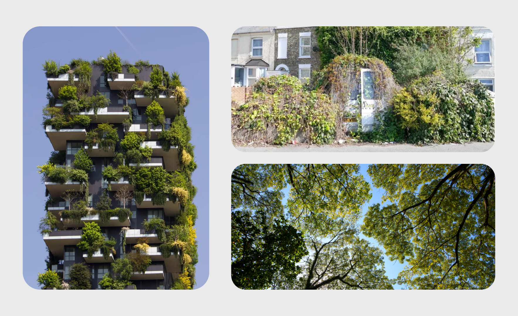
The inspiration for this brand came as I reflected on the future of architecture and its sustainability. As I developed the concept, I arrived at this realization: no matter how much humanity tries, the future of architecture will ultimately be reclaimed by nature. I was inspired by nature’s ability to restore and reclaim its space over time and by the idea of a world where architecture doesn’t seek to dominate nature but rather coexist with it. This project envisions a future where architecture evolves alongside the natural environment—a true symbiosis between the organic and the structured.
I connected this to Puerto Ricans' fight to reclaim their space and culture, mirroring nature’s resilience. This parallel shaped my vision of an architectural future that is deeply rooted in resilience, restoration, and coexistence.
Logos


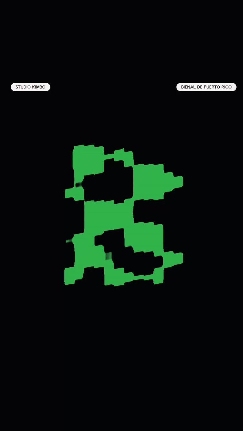
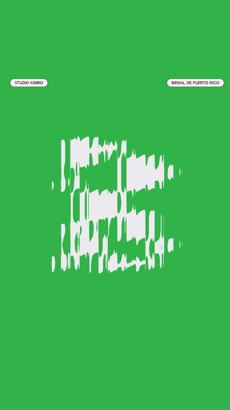
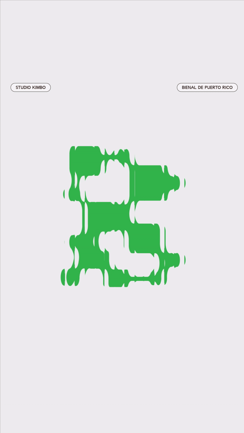
The typography for the logo has been extensively customized to create a one-of-a-kind look.The logo draws inspiration from rigid architectural forms while incorporating an organic touch to represent nature’s gradual erosion of buildings and its reclaiming of space. I also wanted to infuse a technological feel, reflecting the influence of future sustainable technology in the design.
Color Palette

The color palette remains simple, with a striking bright green that symbolizes the oxidation of materials over time, a silverish white that symbolizes titanium—one of Earth’s most durable metals—and an onyx black.
Type Pairing

The typography is rigid and structured, creating a deliberate juxtaposition with the organic elements of the brand.
Elements

A corroded "B" is prominently featured in the merch, tying back to the Bienal identity and reinforcing the theme of nature reclaiming architecture. It can also be used as a background texture.