Jael Poma

I had the pleasure of creating a visual identity for Jael Poma, a talented indie soft pop music artist who pours his heart into songs about love and heartbreak. Inspired by his vulnerable and authentic lyrics, I crafted a brand that captures the beauty and fragility that Jael bravely shows to his audience and the raw emotions of his music.
Logos
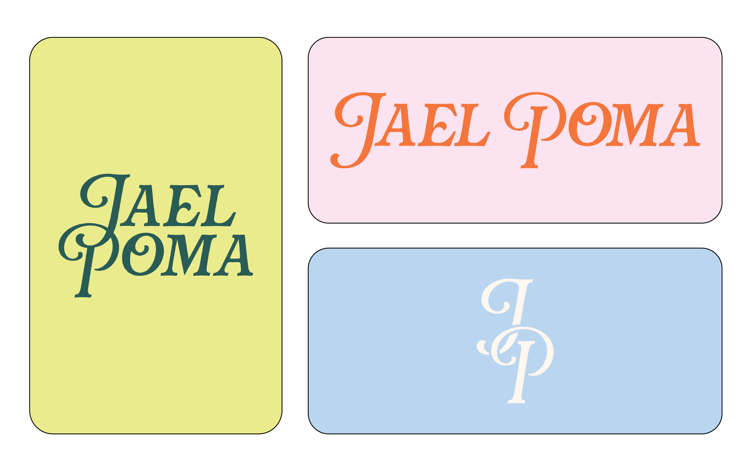
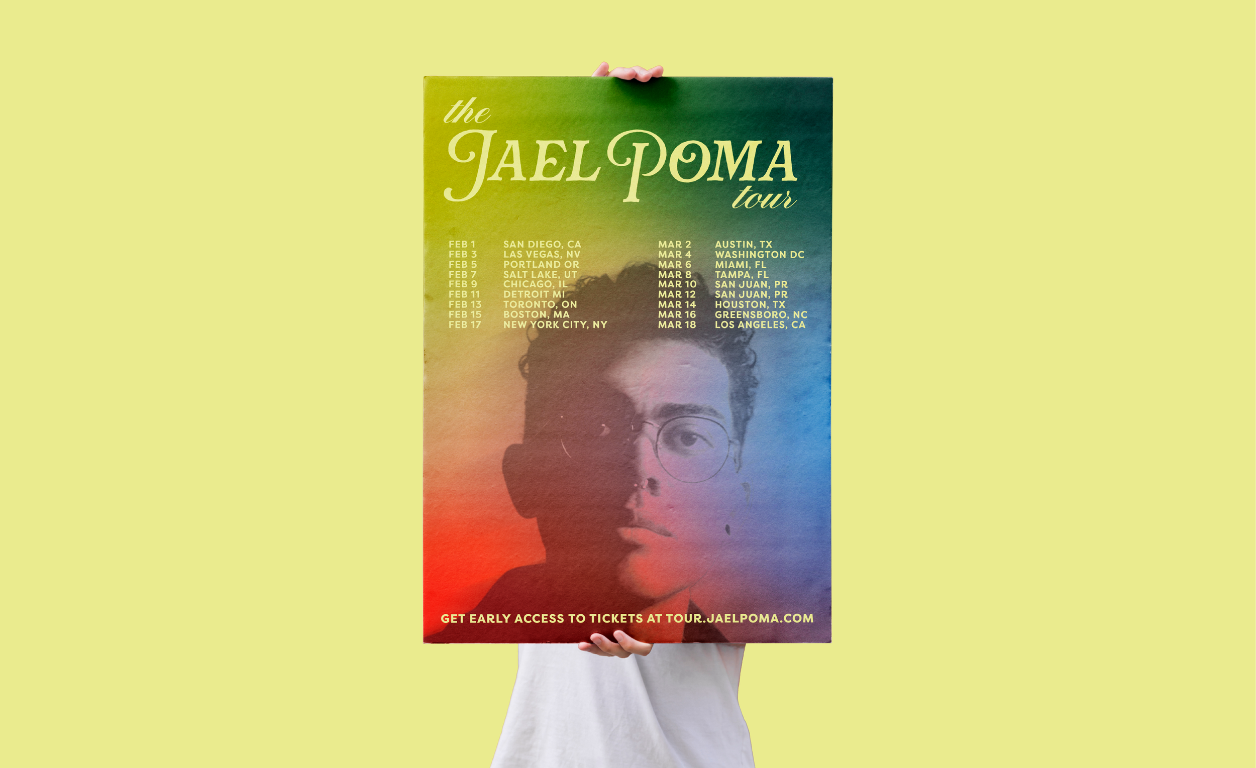
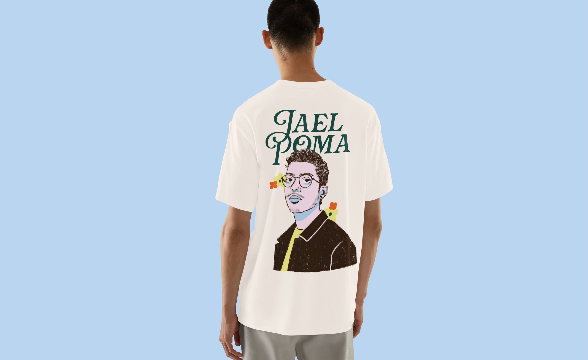
Jael Poma’s logo has 3 variations, each designed for different applications as needed. It features a serif font for an elegant and romantic feeling, while the "J" and "P" are styled to stand out. Delicate floral ligatures in some letters and a subtle texture gives the logo a handmade feeling, making it feel authentic and raw, reflecting the vulnerability in Jael’s songs and lyrics.
Assets and Illustrations
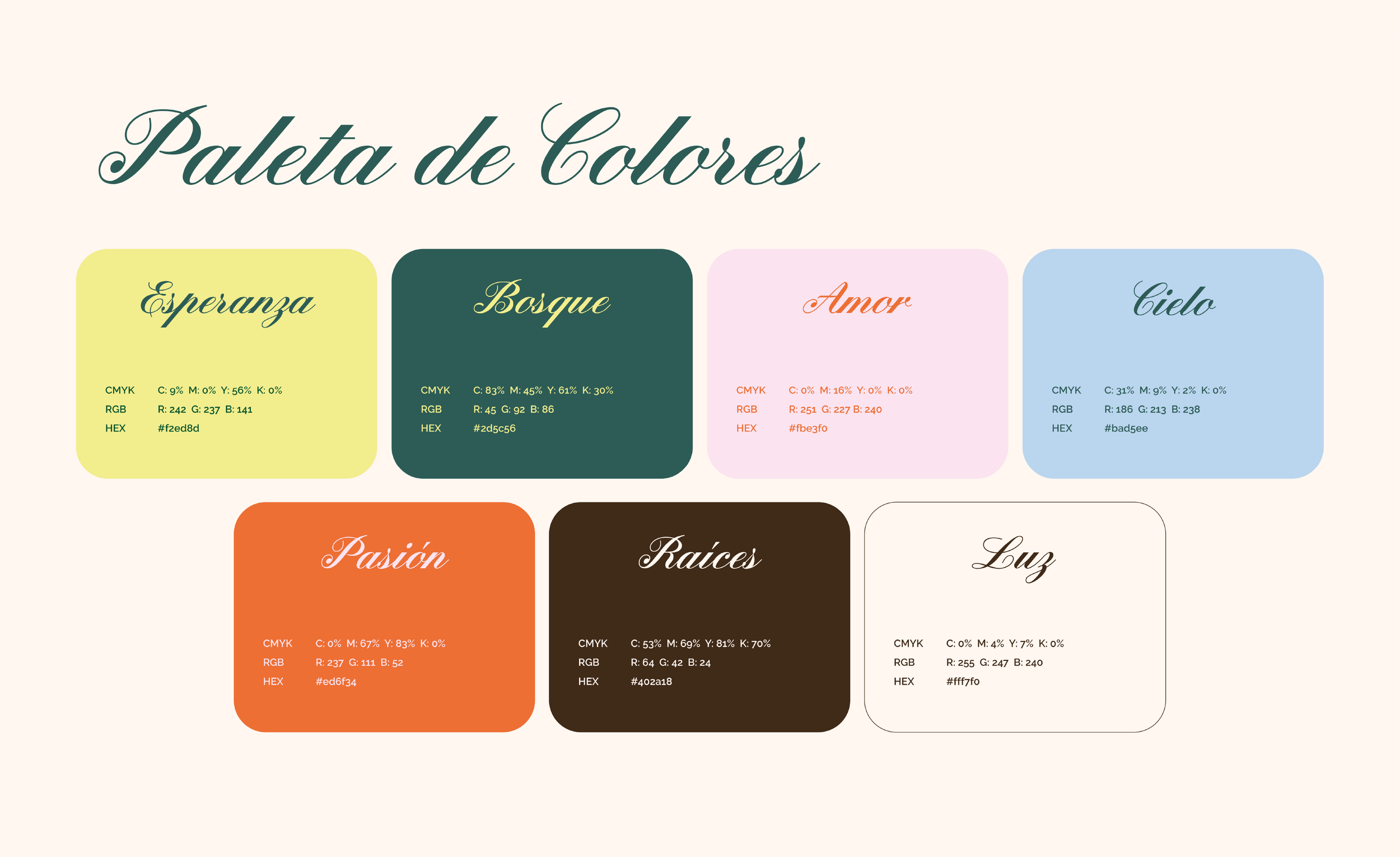
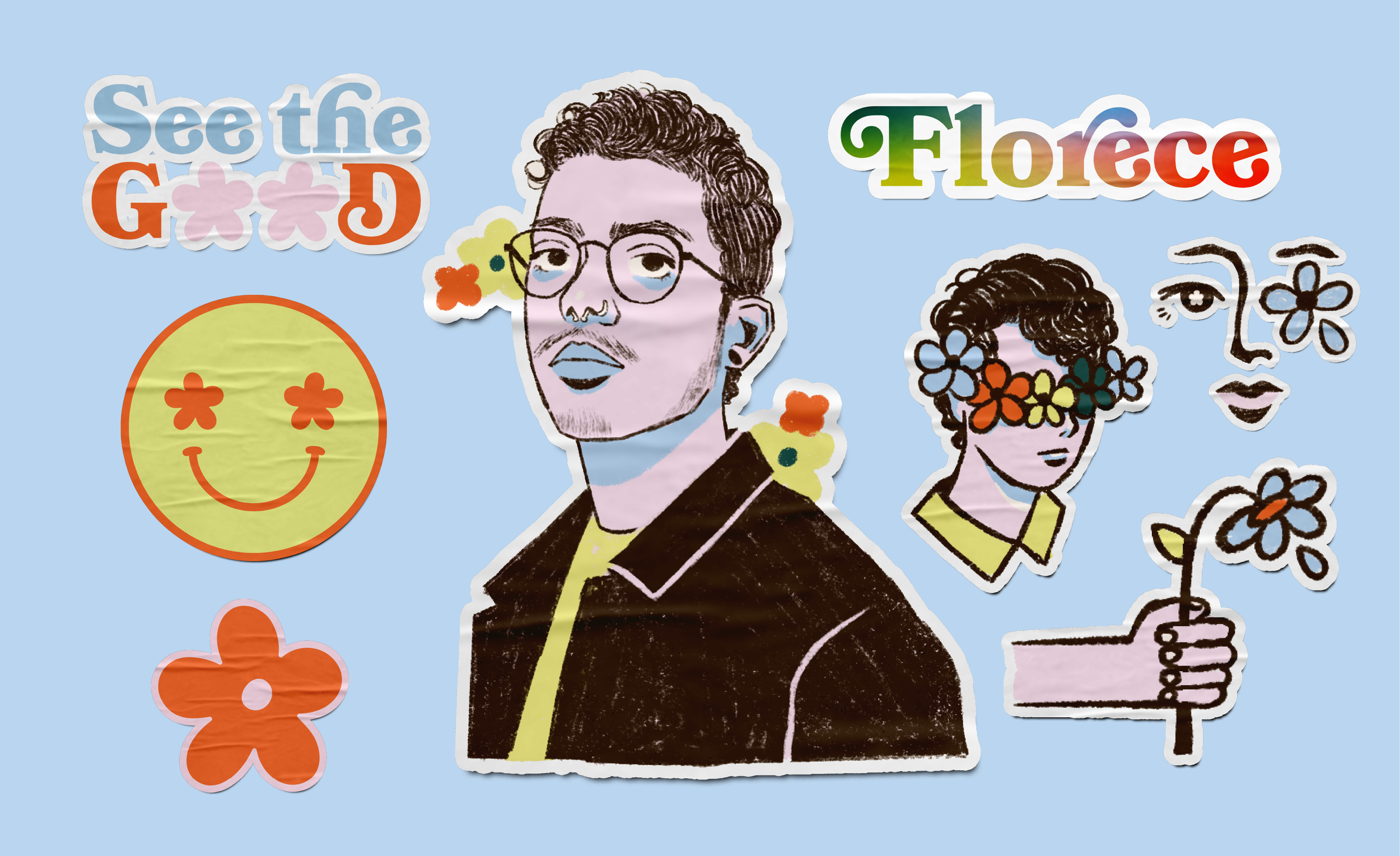
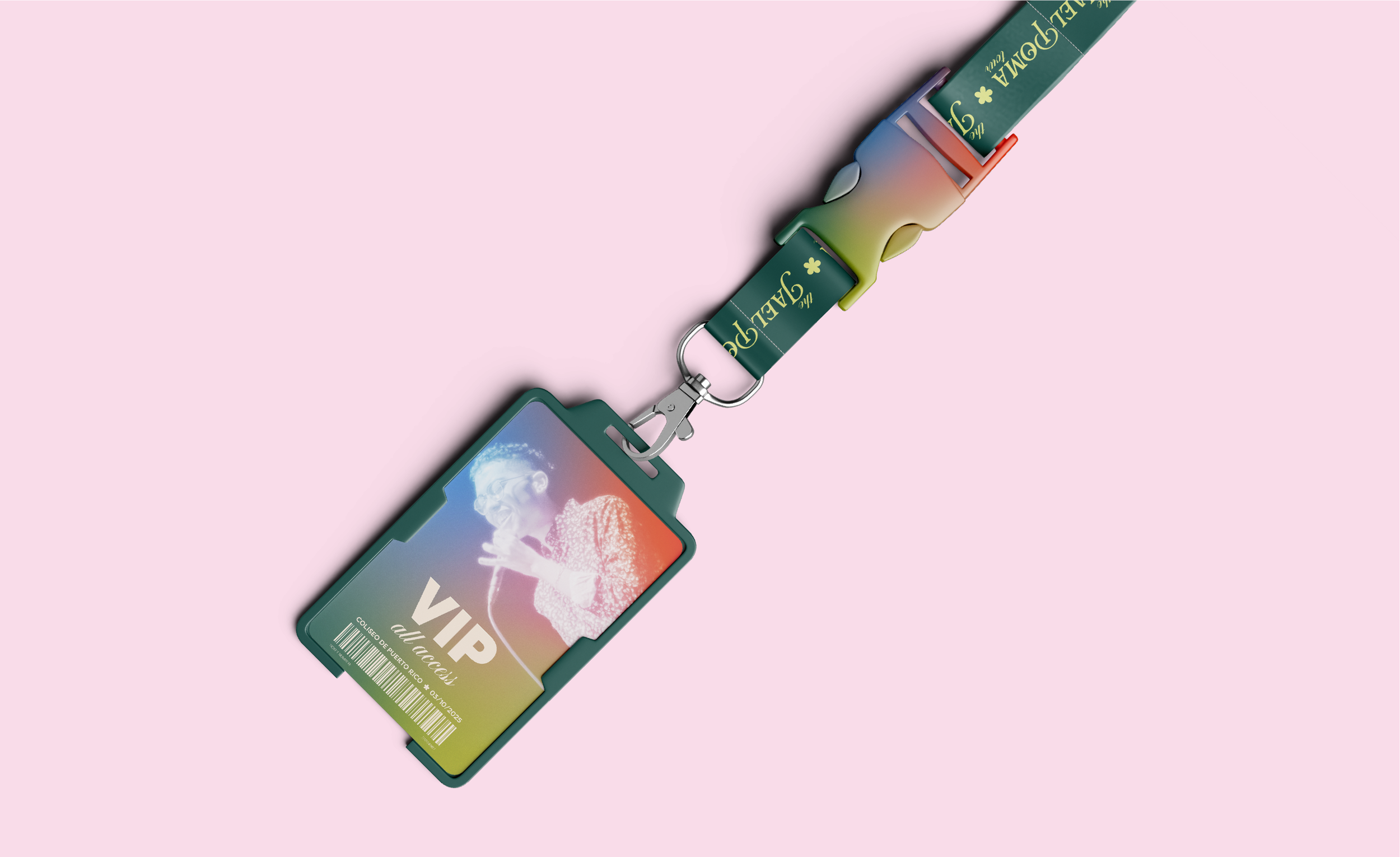
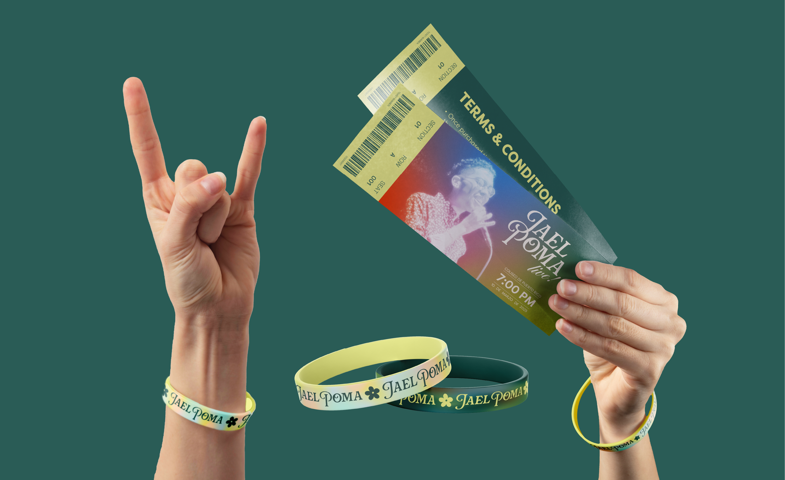
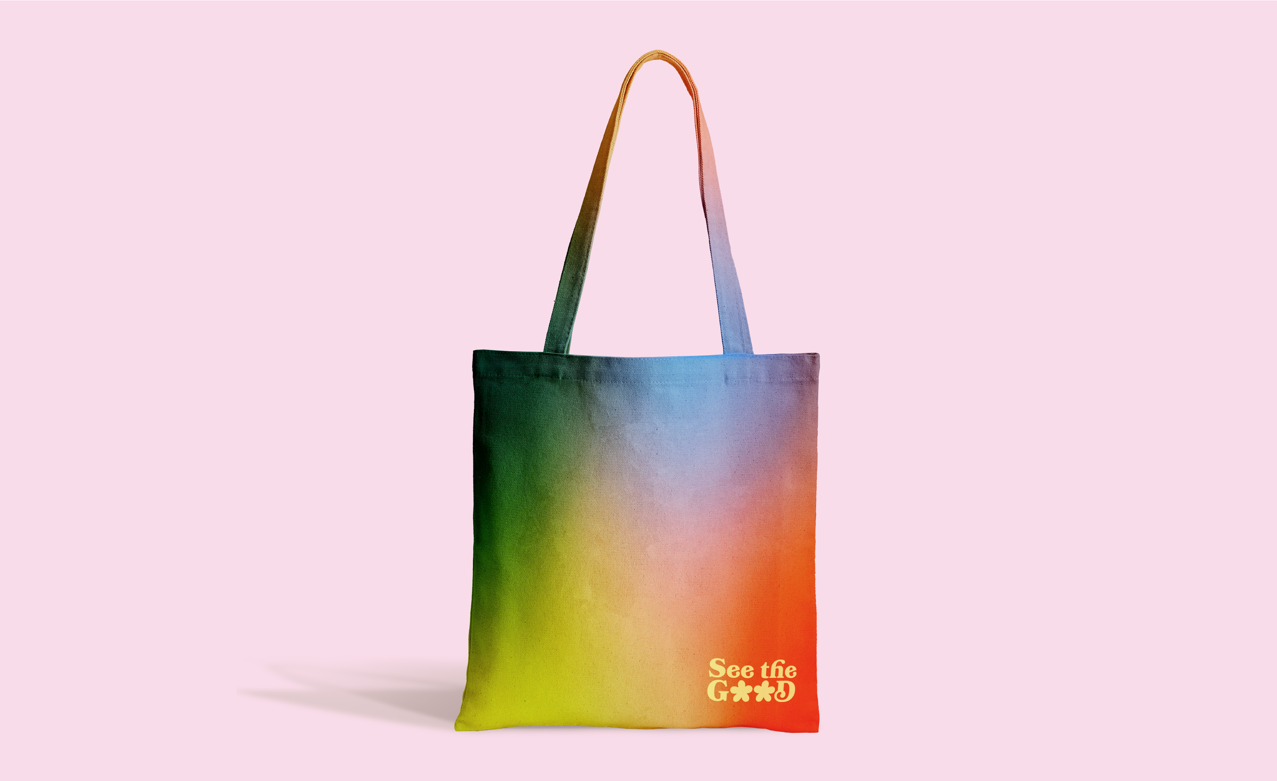
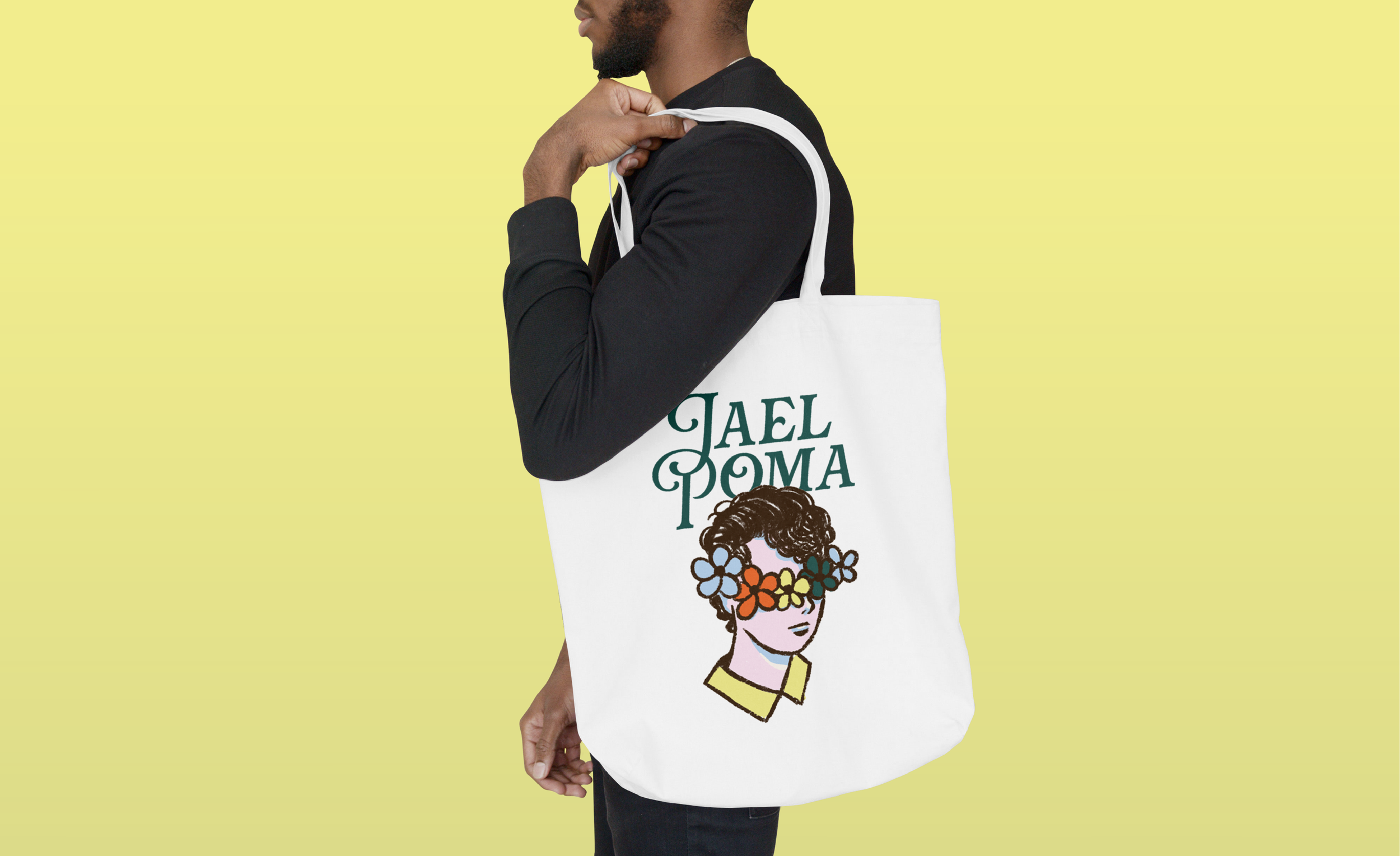
Jael's brand features a pastel color palette to evoke a sense of softness, vulnerability, and romance, reflecting the emotional depth of his music. To complement this, I created illustrations with a delicate, hand-drawn, and dreamy aesthetic. Flowers became a central motif, symbolizing both the beauty and fragility that Jael courageously shares with his audience through his lyrics.