Bakecita
Mexi & Bori sweets with a retro twist.
When Bakecita’s founder came to me, she wanted a brand that felt feminine, retro, and unmistakably Latina. She needed something playful and approachable, with enough personality to stand out in a pastel-colored baking world.
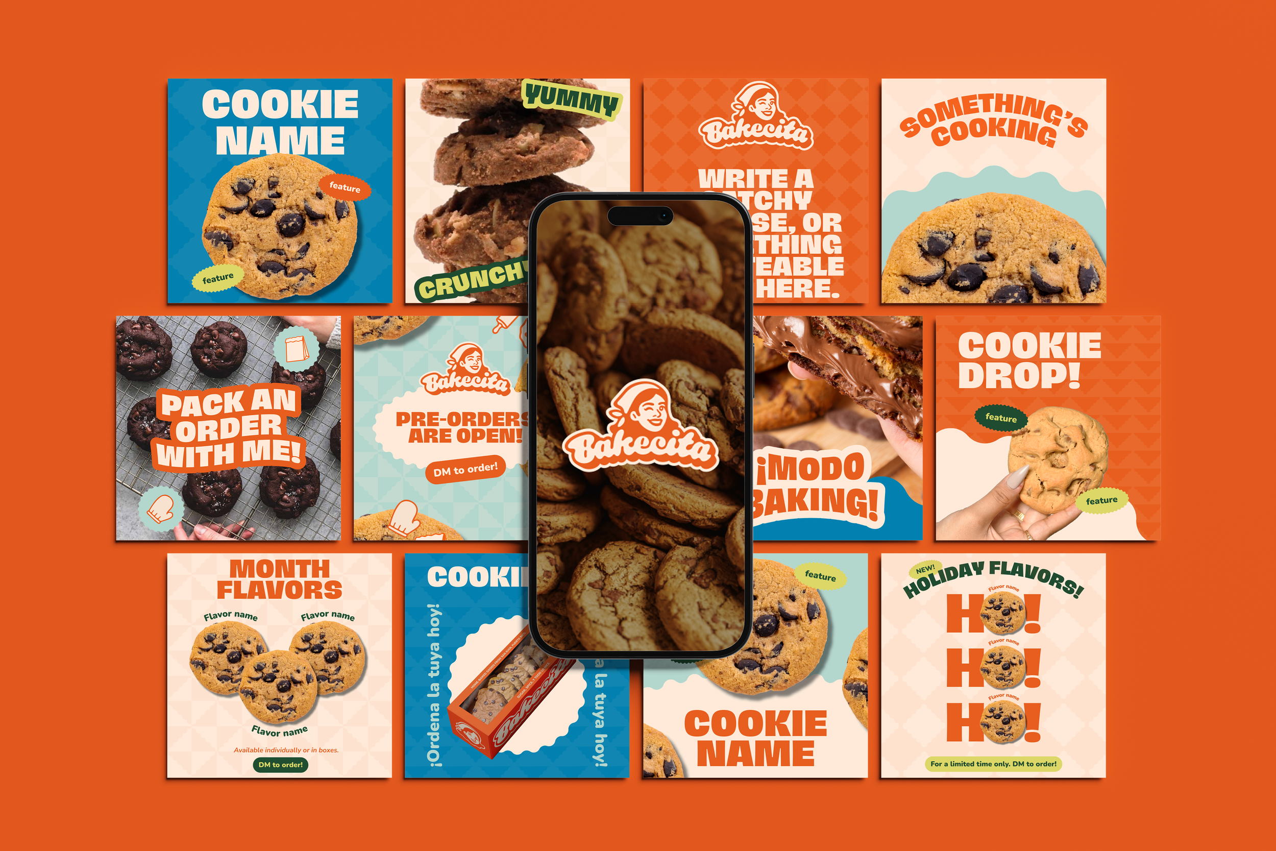
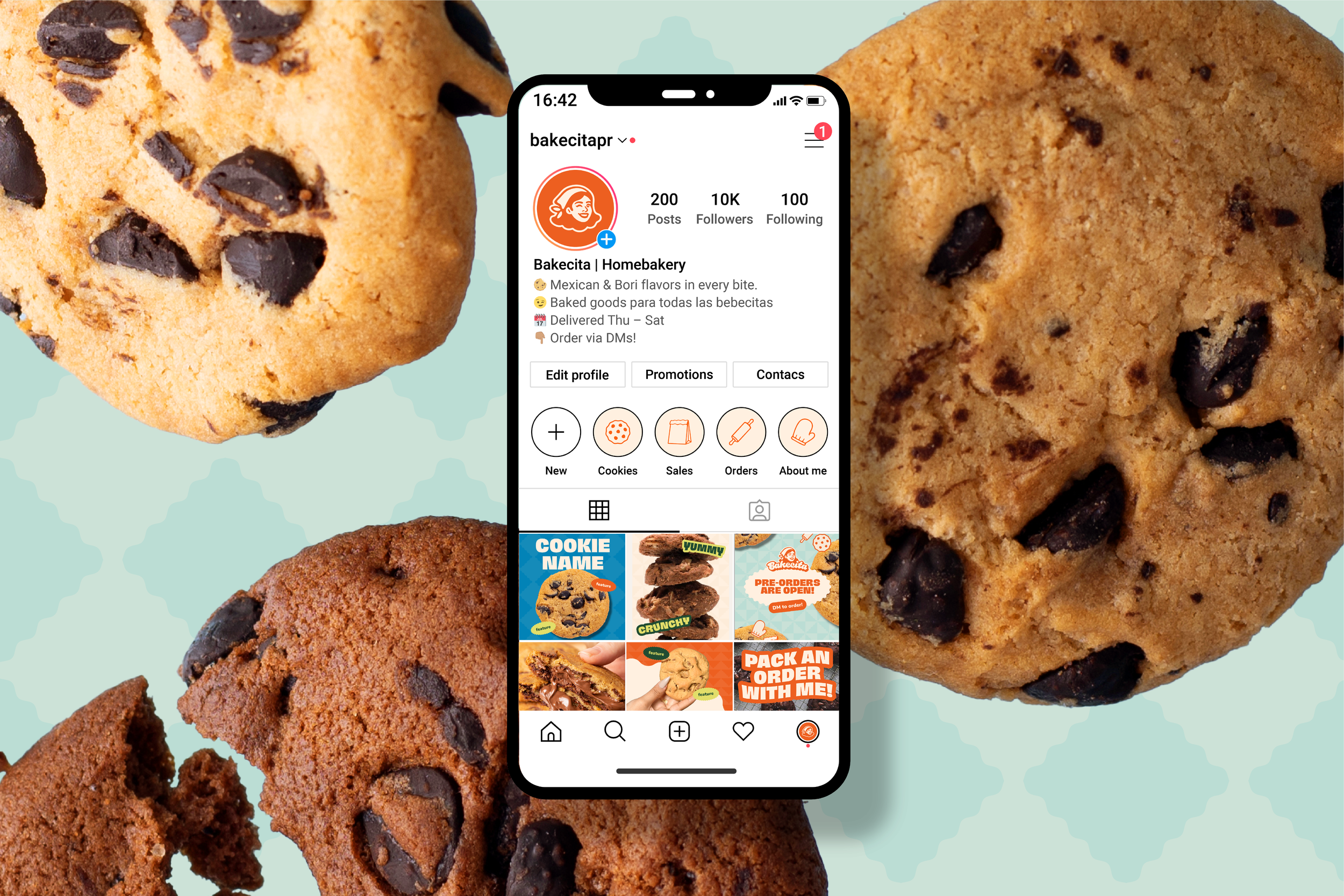
I built her brand from scratch: bright, bold colors to set her apart from the crowd, a mascot to bring that retro charm to life, and creating social media templates so she can focus on what she does best: baking!
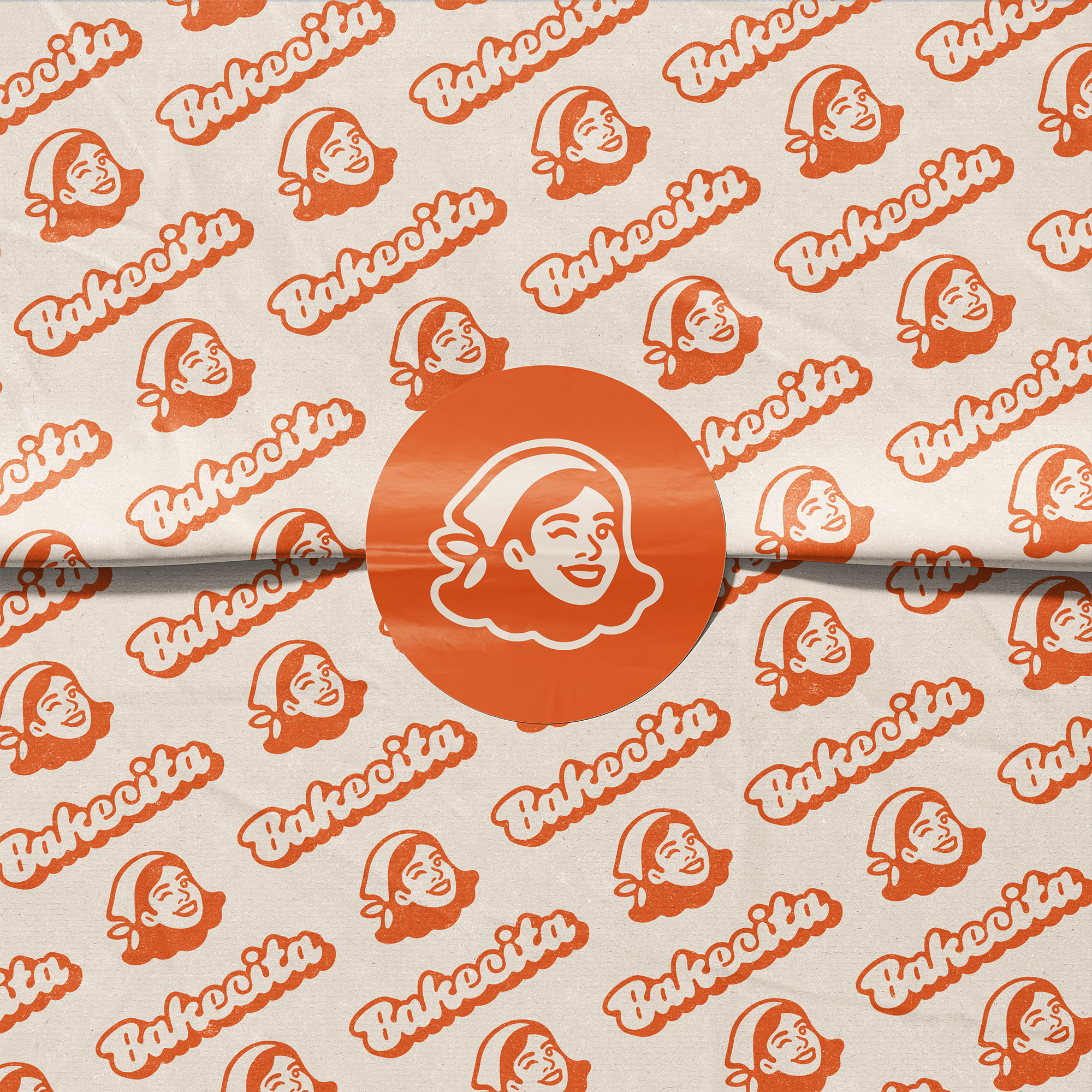
Logo
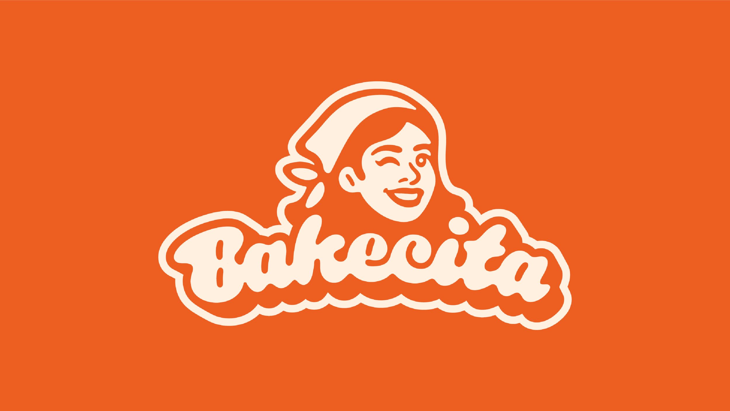
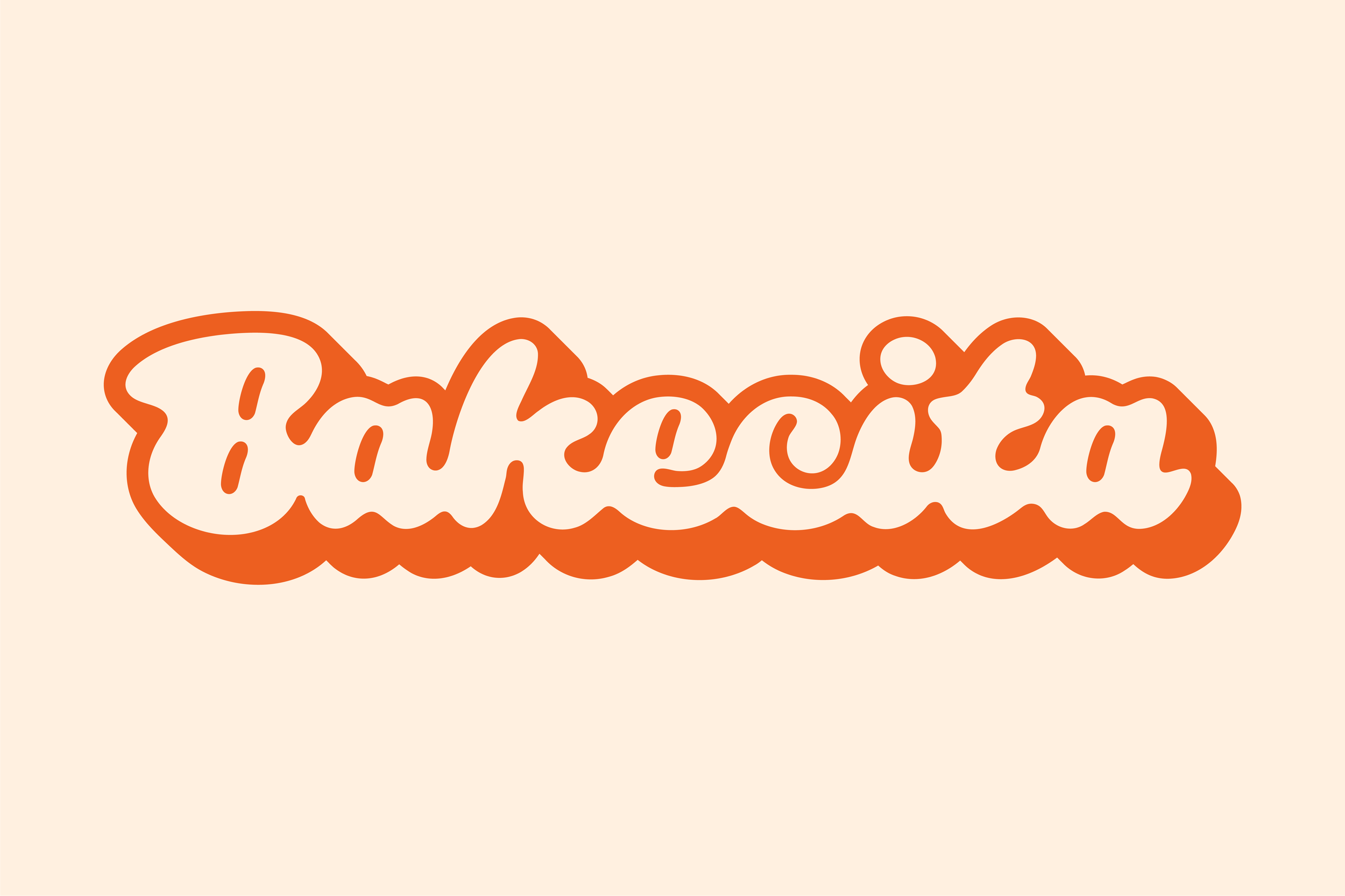
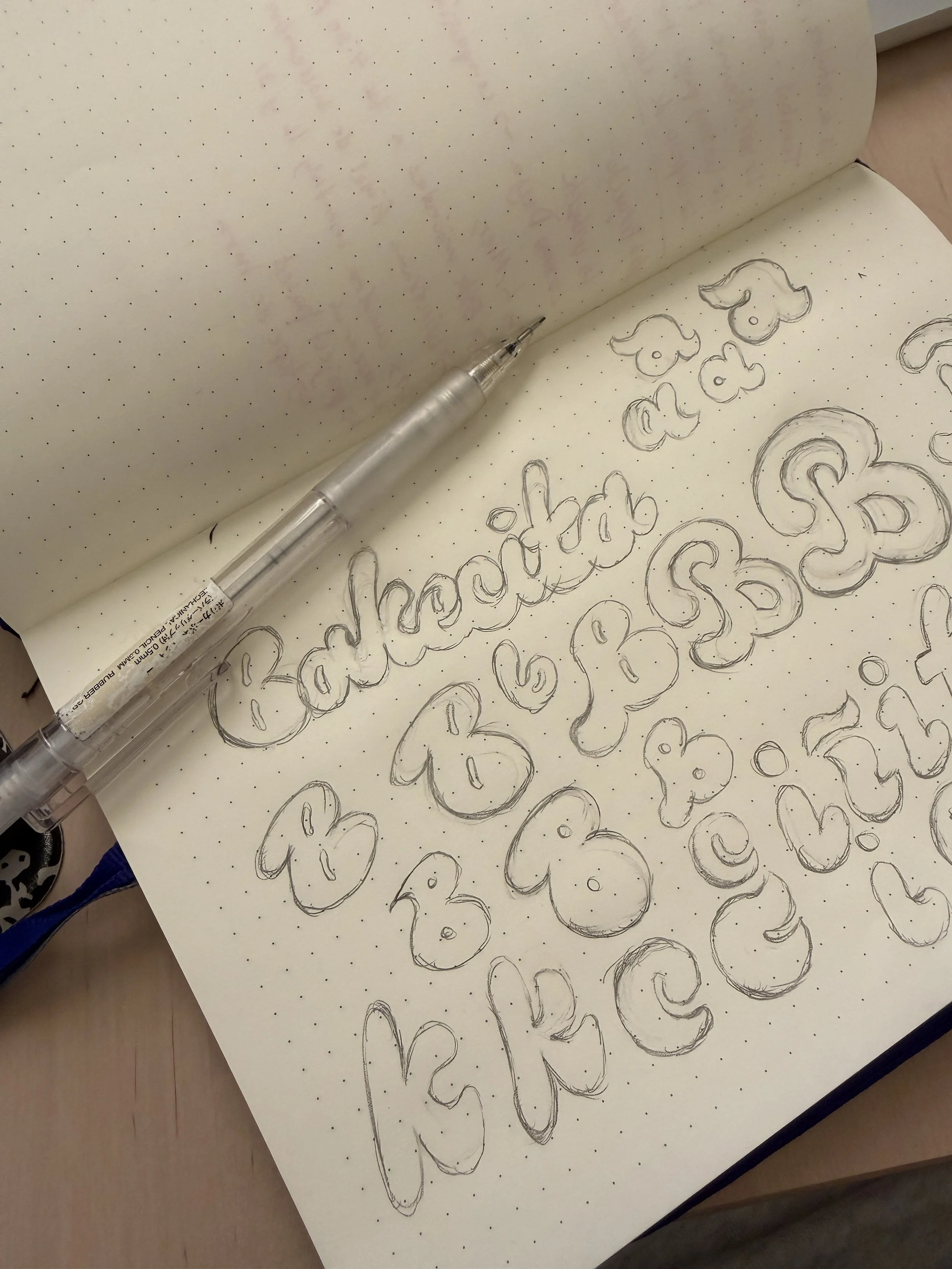

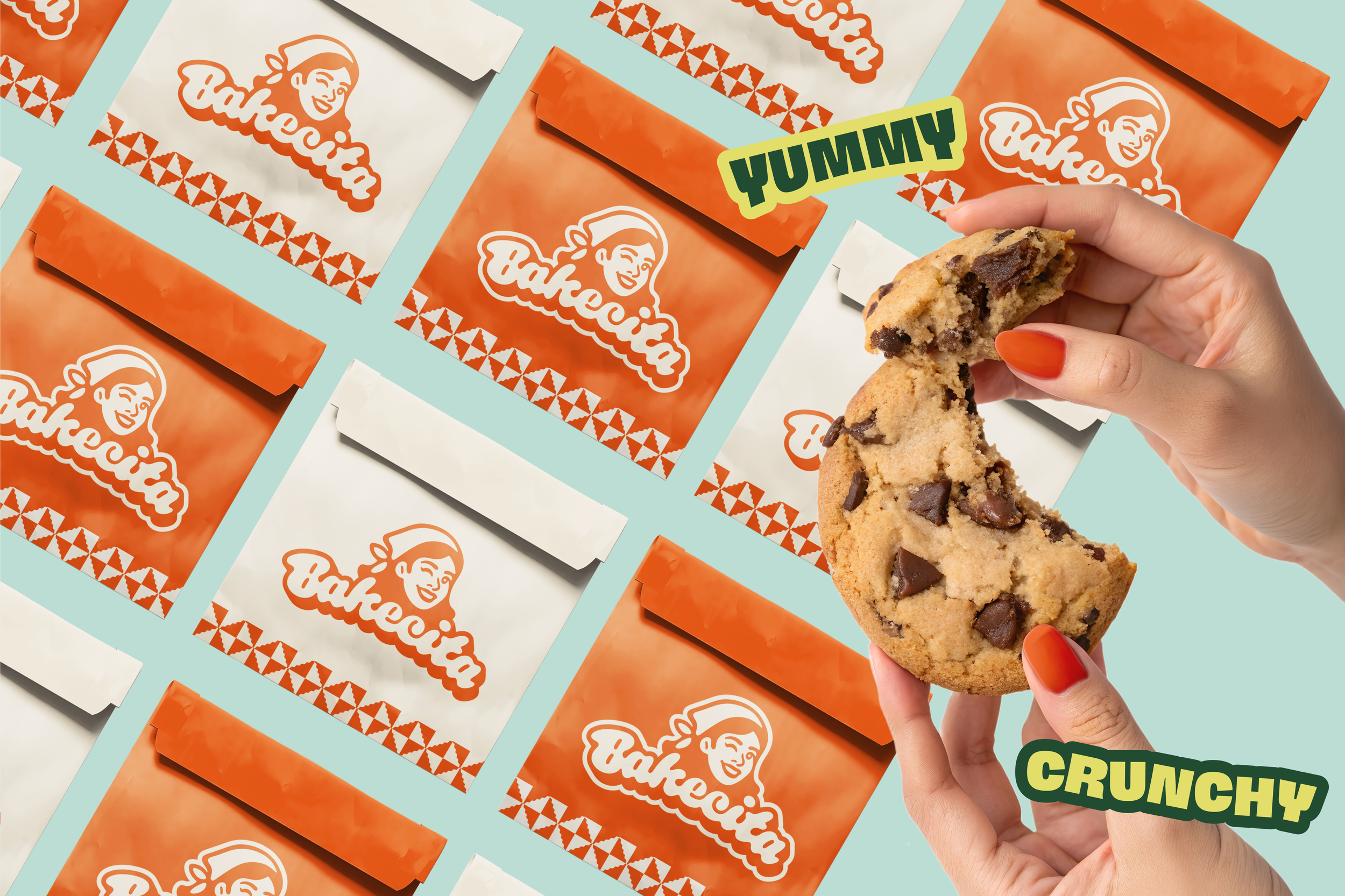
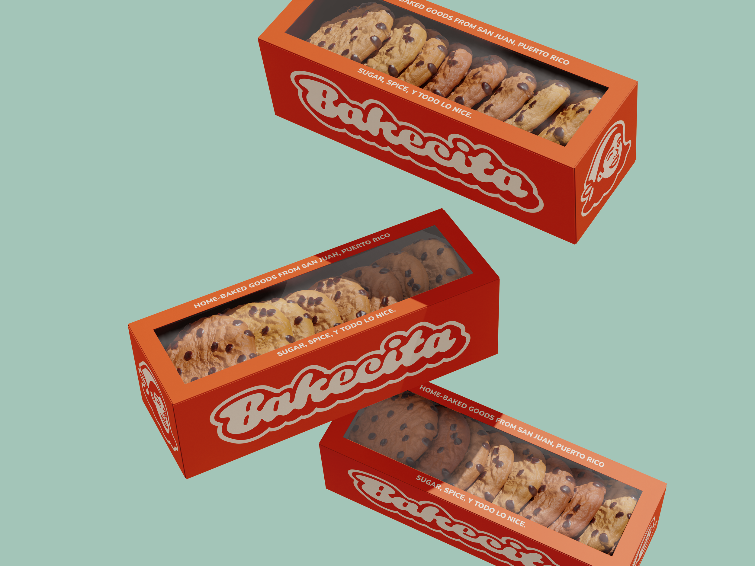
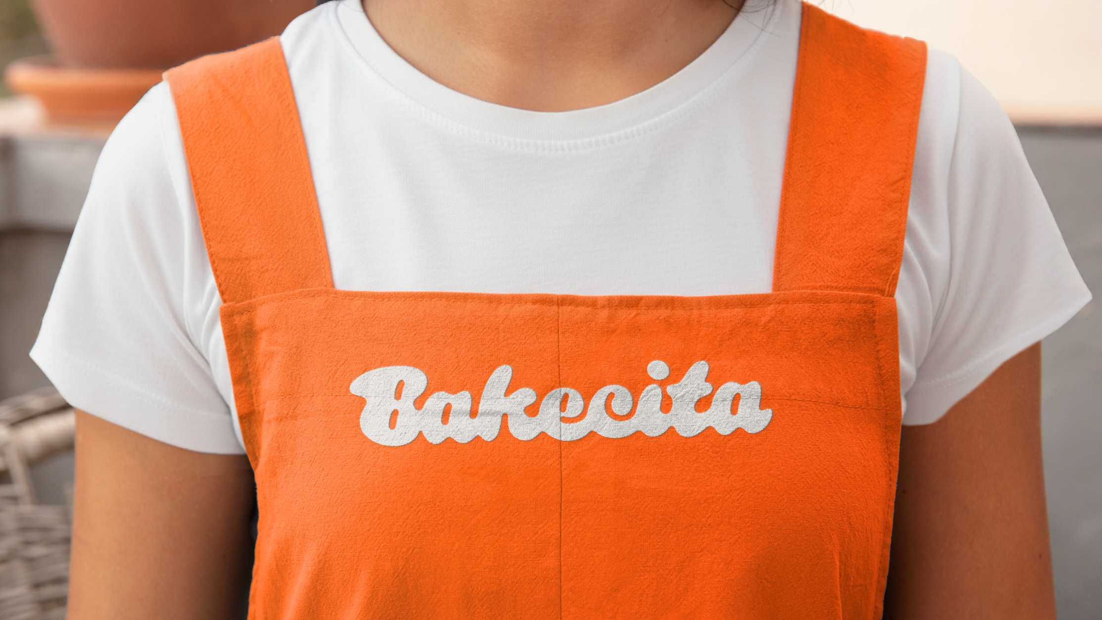
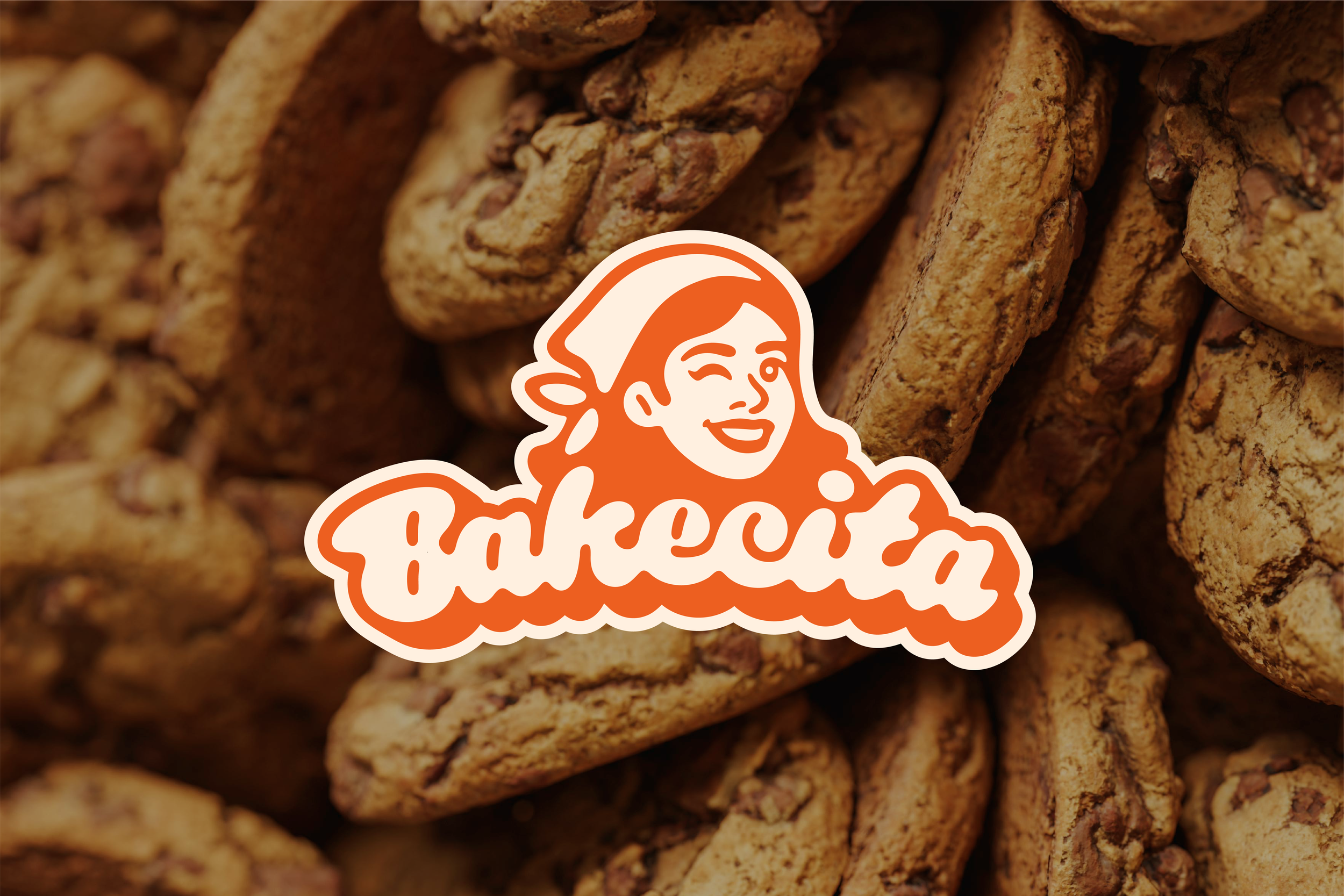
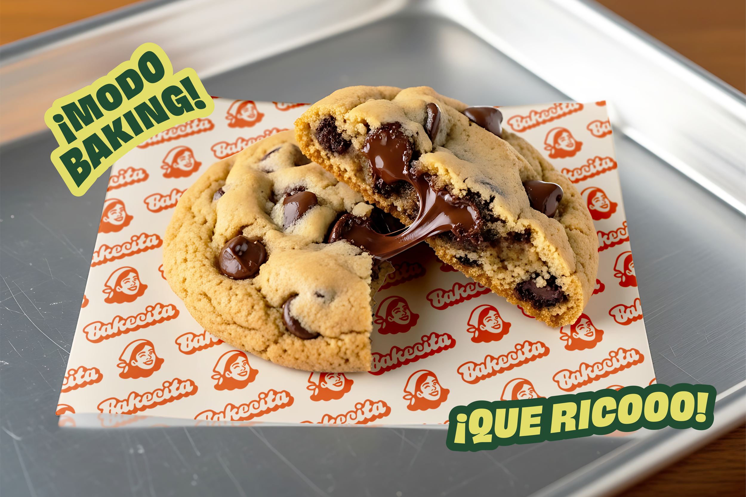
The logo suite includes three versions: a full logo, a typographic logo, and a mascot logo, giving the brand flexibility across different use cases and formats. The typographic logo was drawn by hand and then vectorized, designed to feel retro and goopy, like pulling apart a cookie to reveal melted chocolate inside.
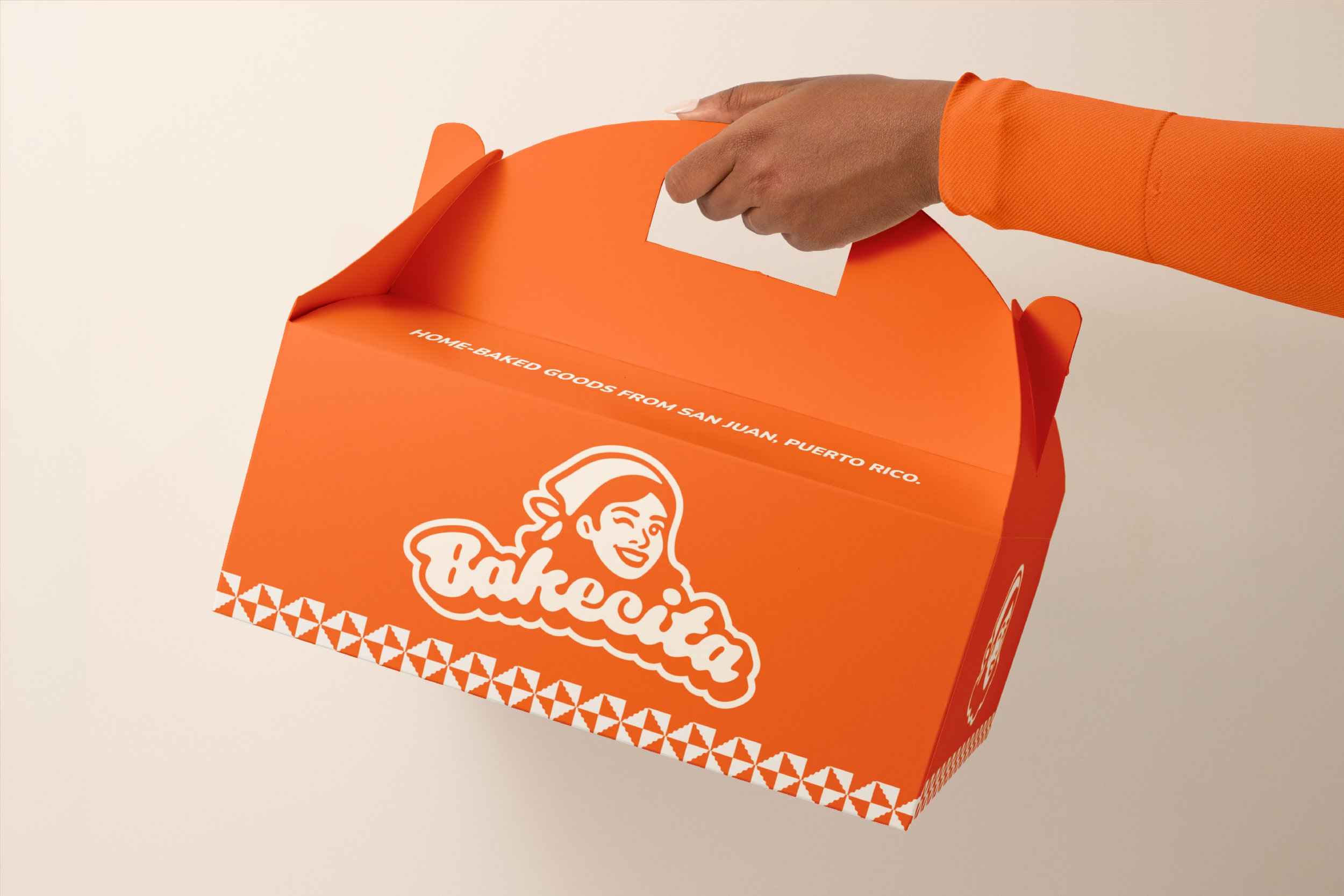
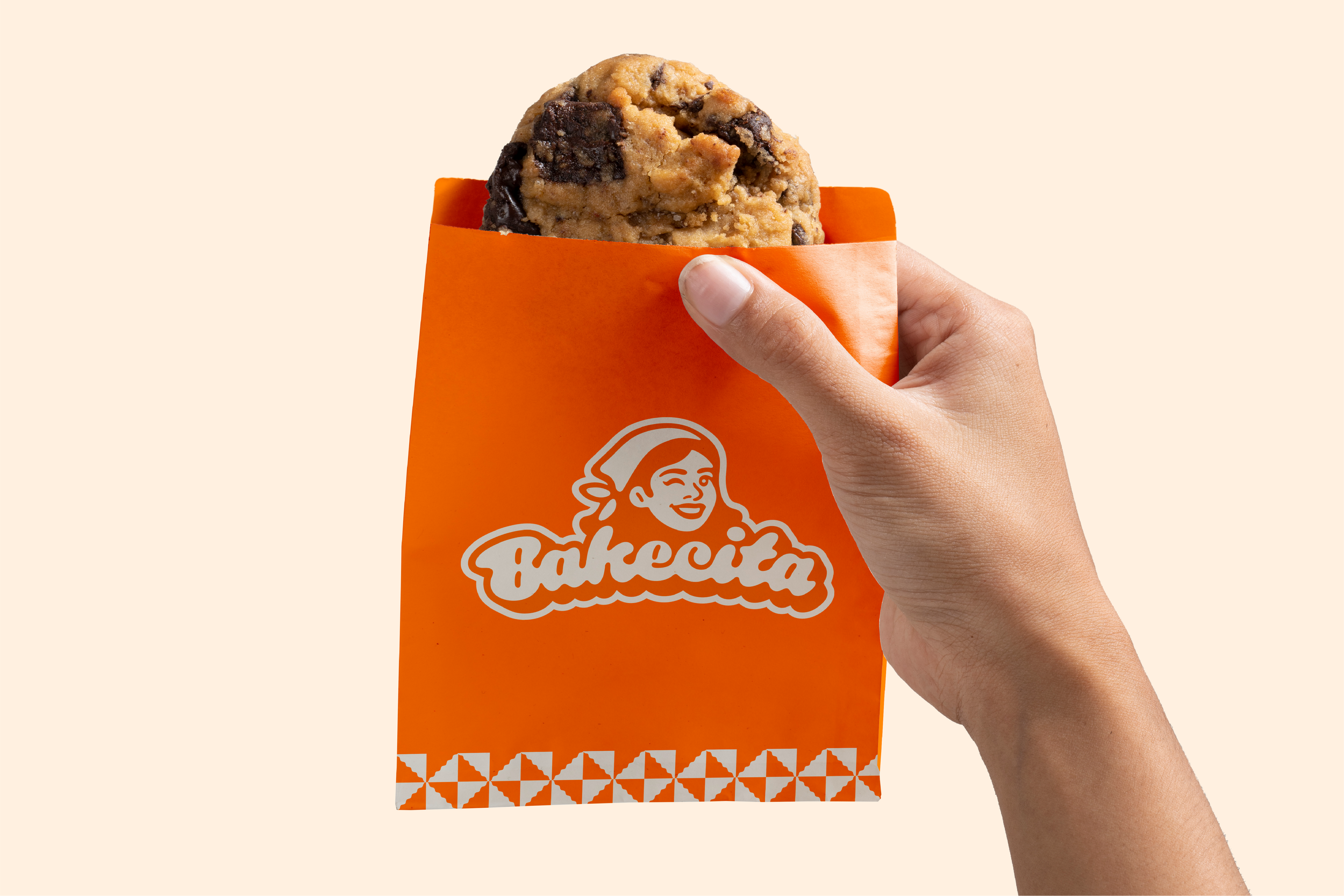
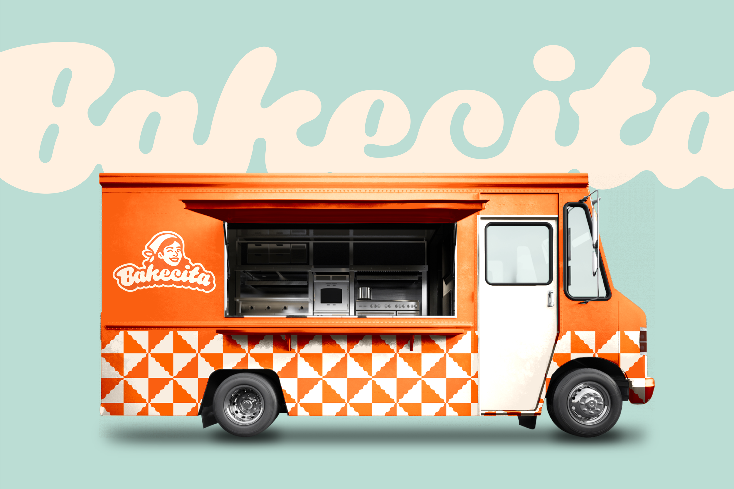
The mascot was designed in the founder's likeness. Rather than the traditional baker's hat, she wears a homey bandana, a nod to the founder's Latinx roots and to the women who cook from home with love, without any pretense of formality. It's a small but meaningful detail that makes the brand feel personal, authentic, and rooted in culture. The winking action ties it all together: she’s approachable, fun, and feminine, just like a bebecita should be. ;)
Color Palette
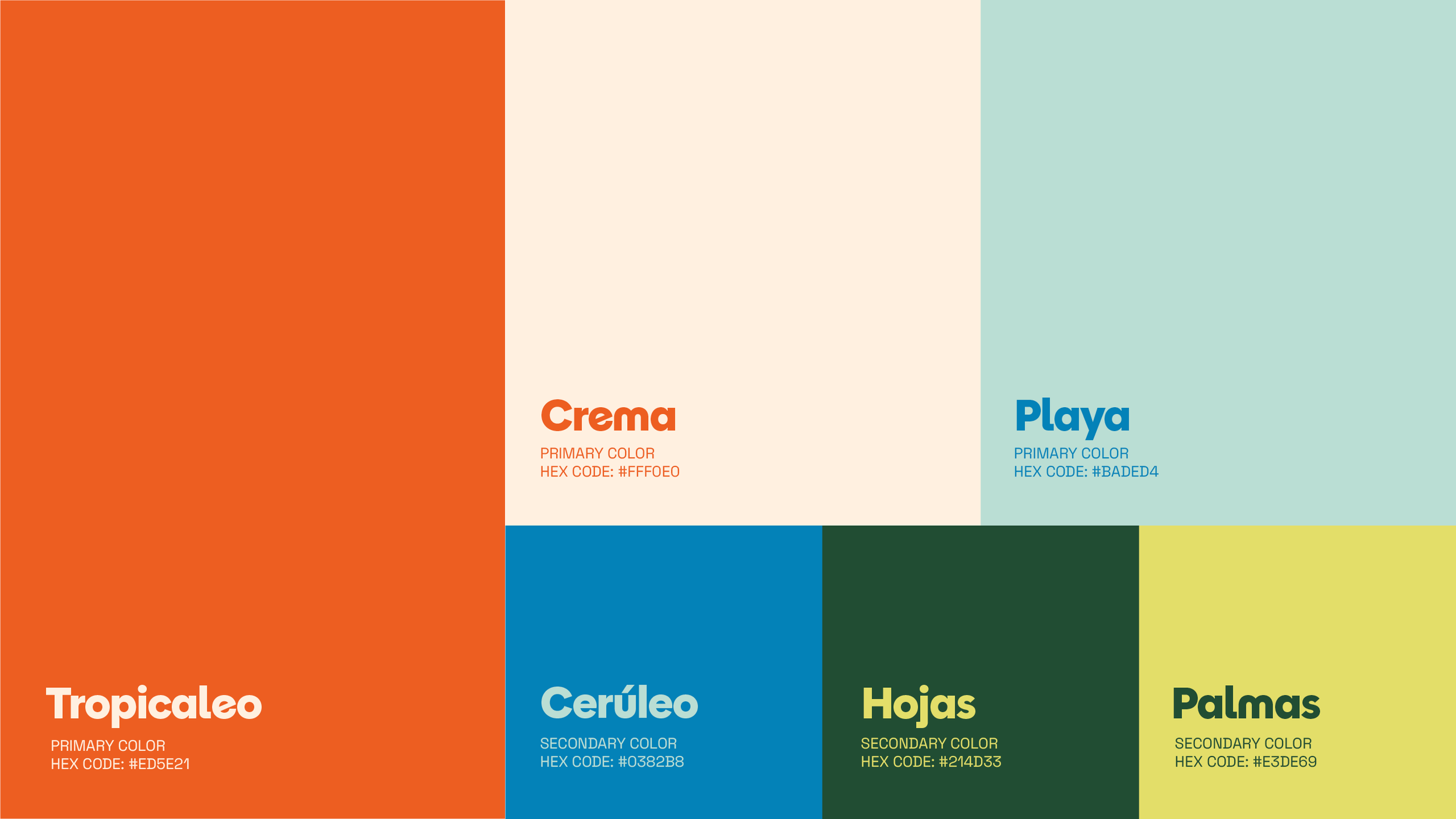
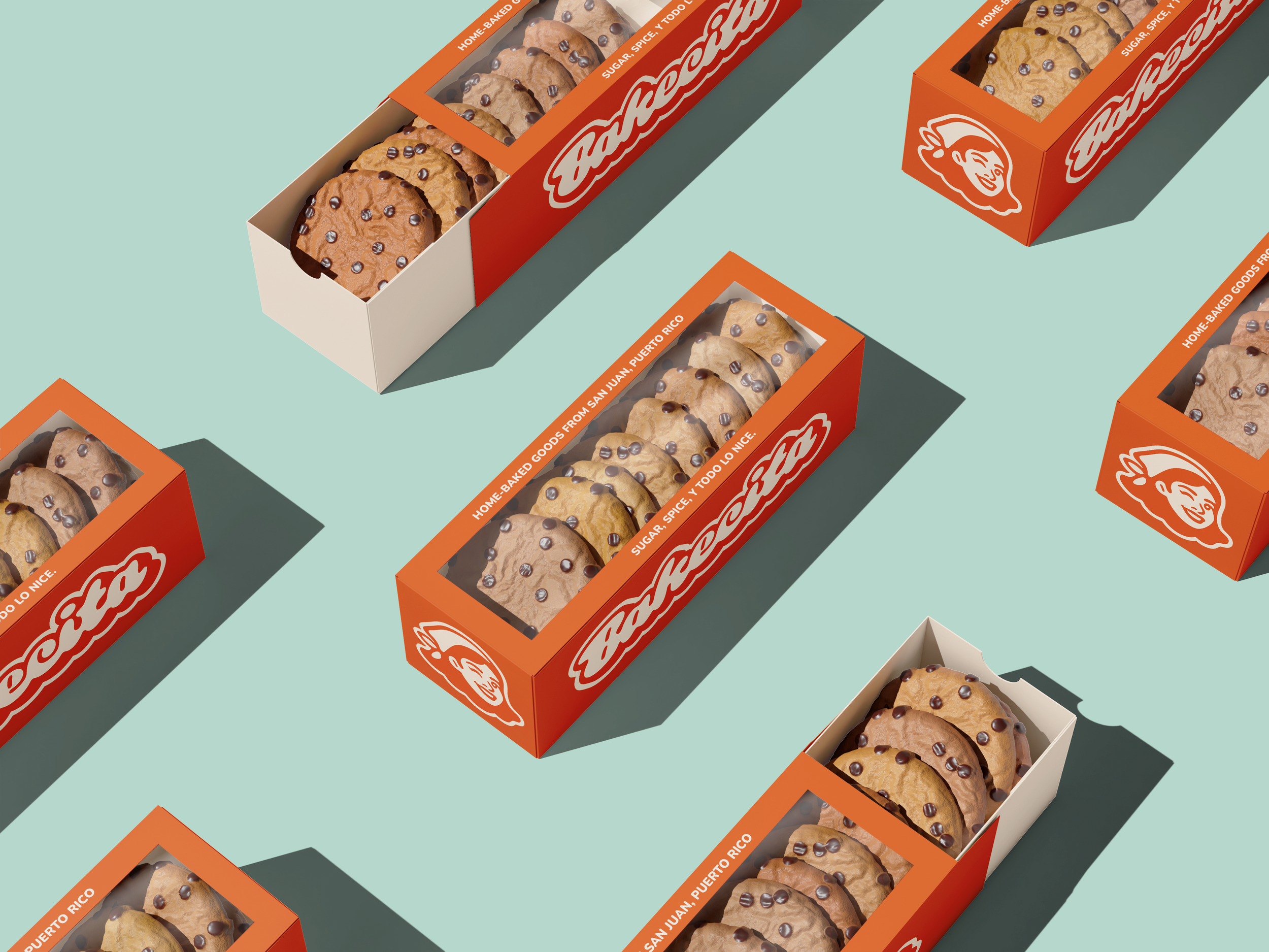
Most bakery brands default to using soft pastels or neutral tones, so going bold was a deliberate choice. A bright orange anchors the brand as its primary color: a strategic pick, since nearby competitors had already claimed blues and pinks. It's warm, tropical, energetic, and impossible to ignore. Orange is paired with a creamy white and a soft baby blue for balance, keeping the brand feeling sweet without being overwhelming. Deeper greens and a darker blue round out the palette as accents and backgrounds for social media posts and other marketing material.
Graphic Elements
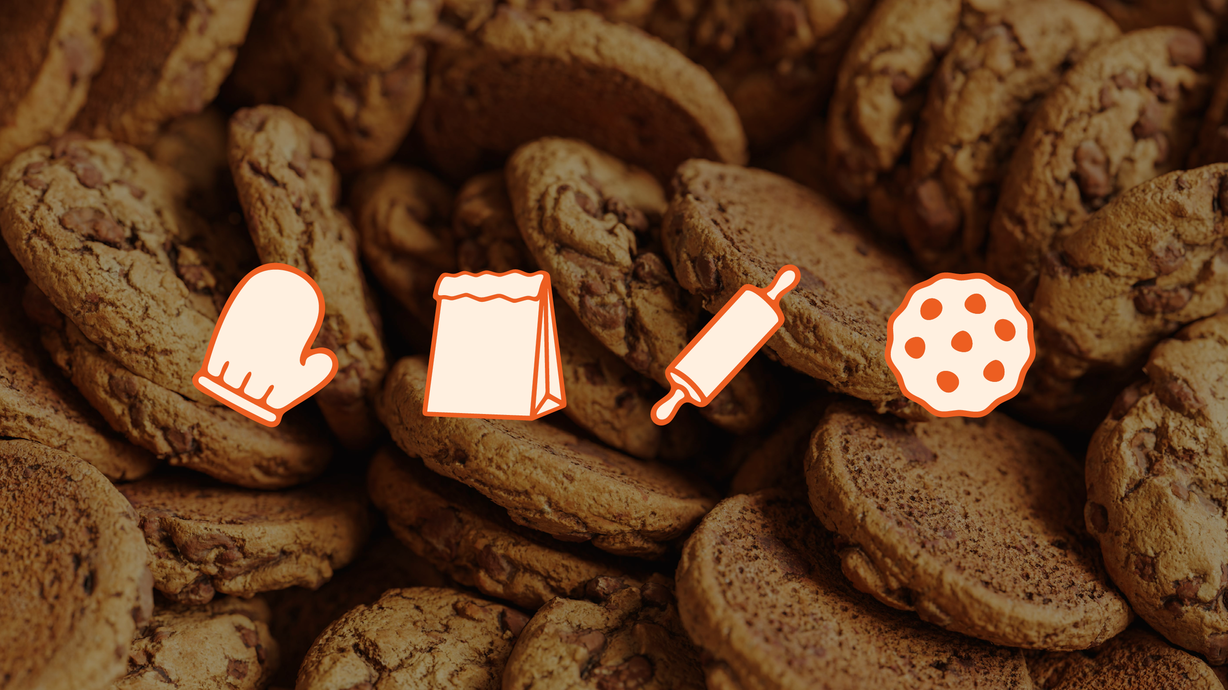
To give the brand a complete, cohesive look, I created a set of hand-drawn baking icons with soft, rounded edges that echo the same goopy energy as the typography.
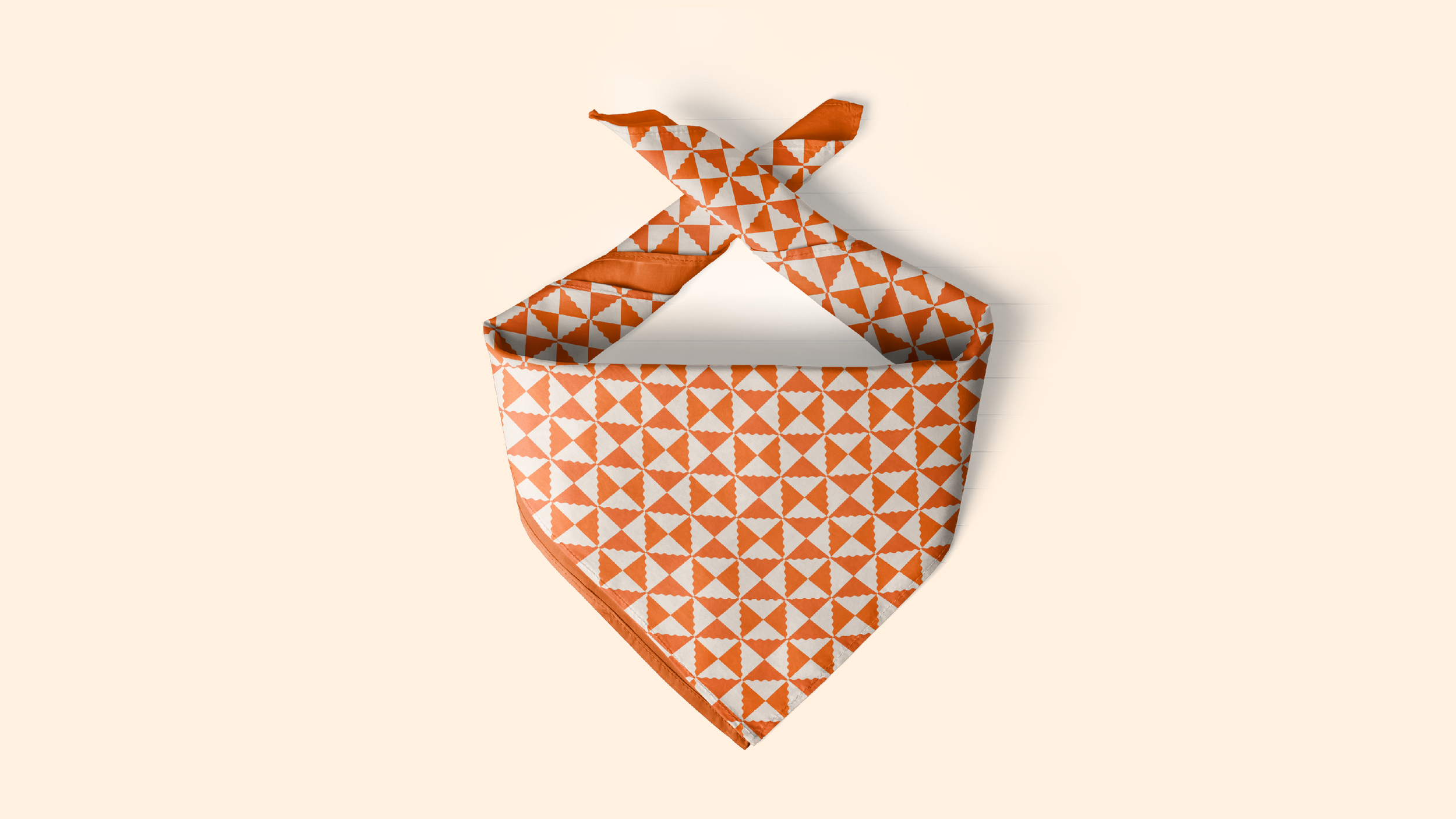
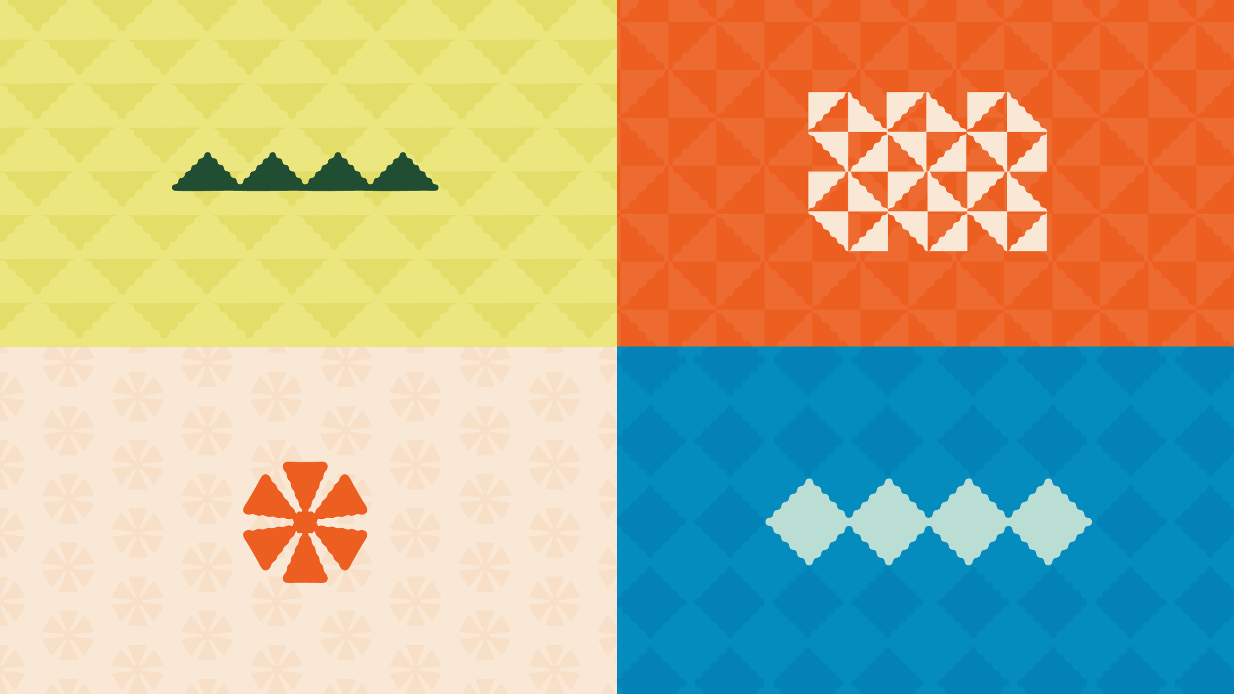
The patterns draw inspiration from Oaxacan textiles, grounding the brand in its cultural roots while keeping things visually fresh. Like the icons, they carry the same rounded, slightly pointy corners that run throughout the brand's visual language. Versatile by design, they can be arranged in countless ways across social media, packaging, and other brand touchpoints.
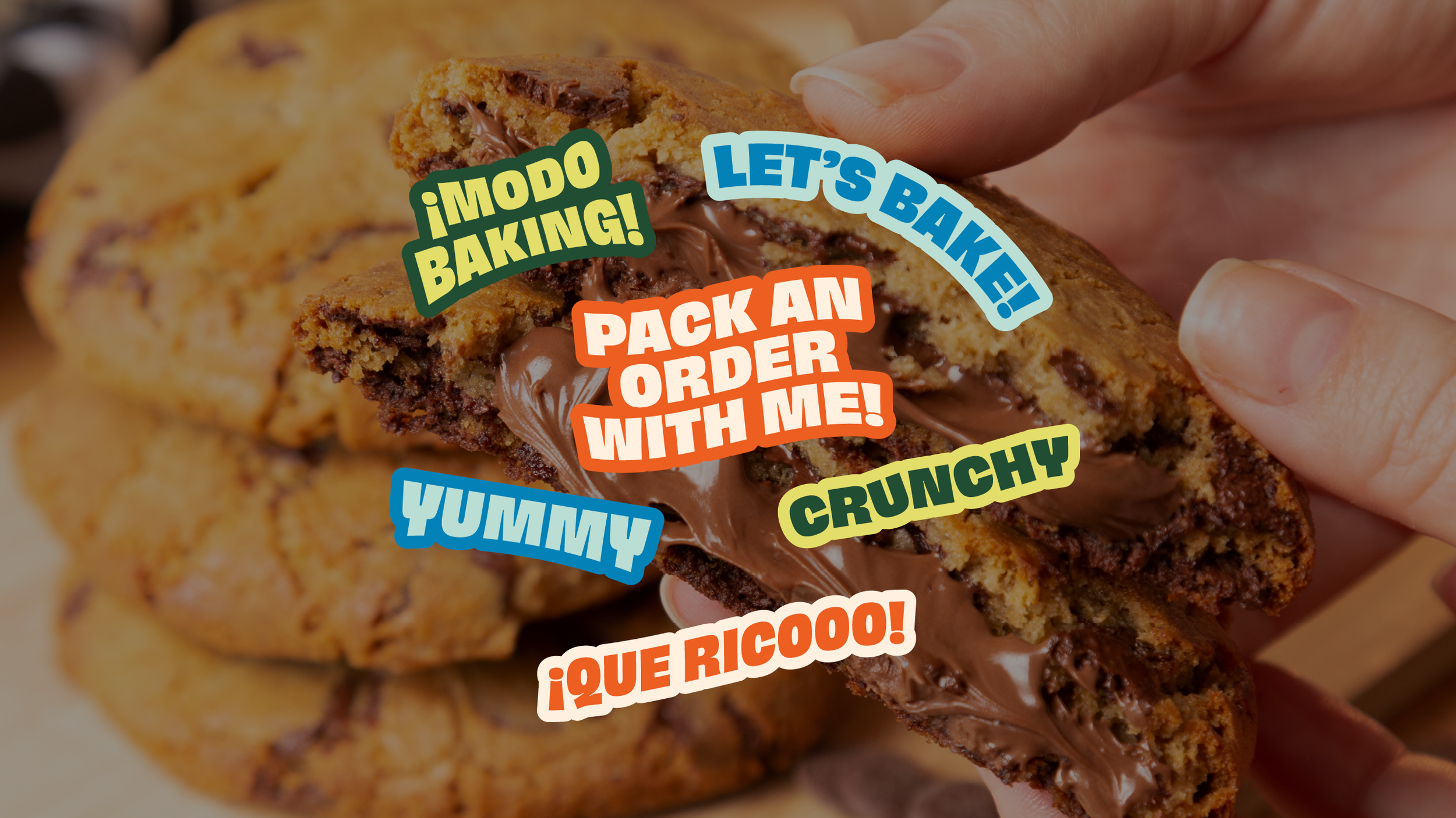
I also developed a series of sticker-like phrases that capture the founder's playful personality, ready for use into any photo, social post or marketing materials.