Nursing’s Unconference
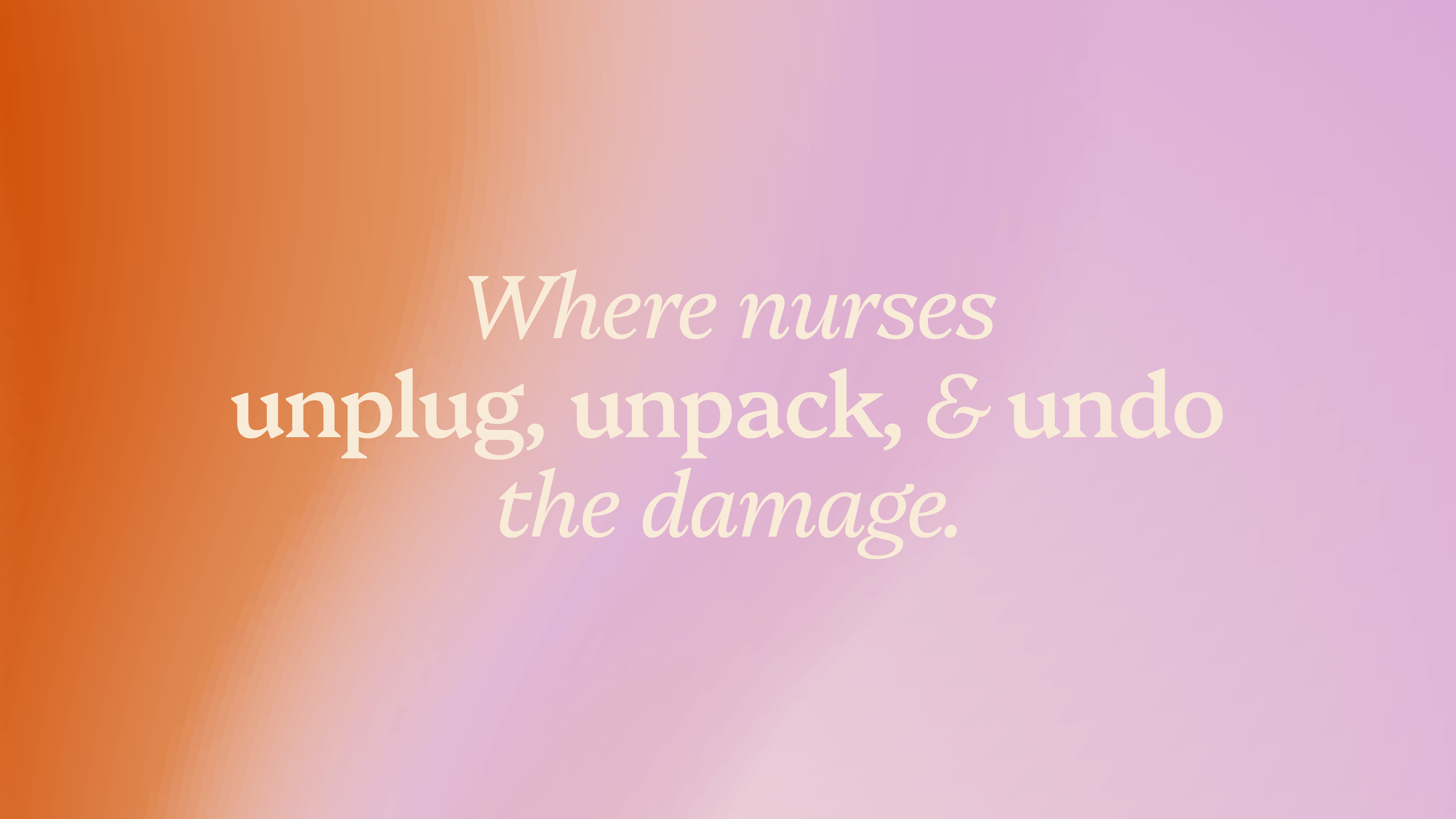
Helping nurses break free from burnout culture.
Nursing's Unconference is a nurse-led collective helping nurses unlearn the habits that lead to burnout in medical spaces through all-inclusive retreats where nurses restore their wellbeing and prioritize themselves without guilt.
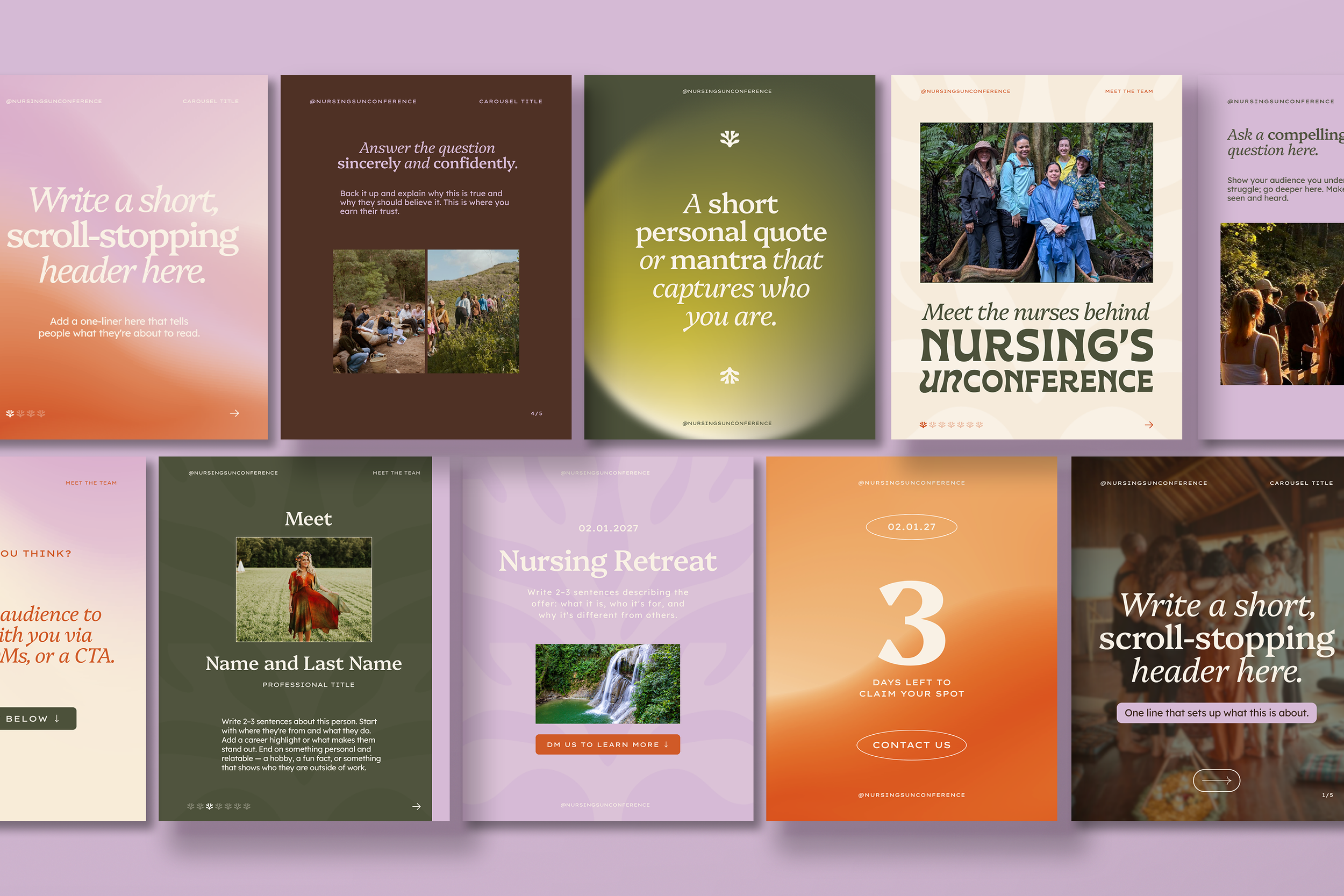
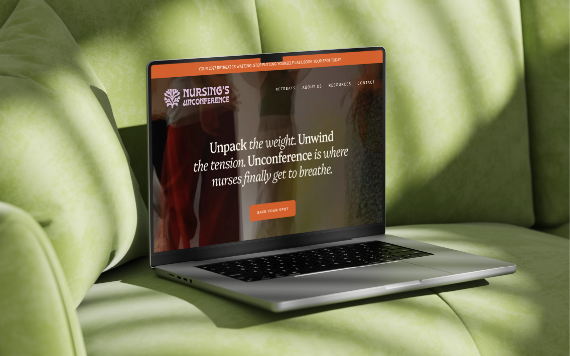
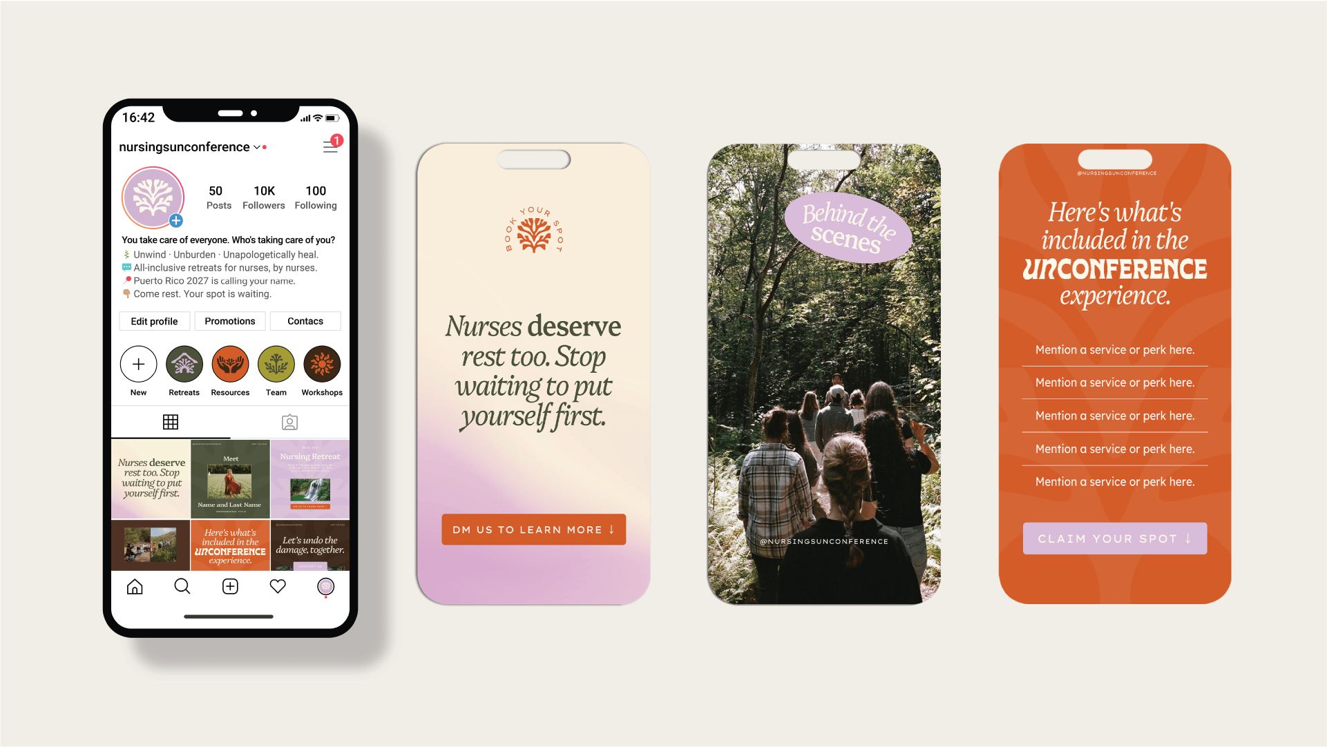
I was brought in to develop their brand identity, with the challenge to create something that felt both restorative and disruptive; something distinct enough to signal a new approach to nursing culture, yet grounded enough to earn trust within the medical community. I also created a suite of social media templates to ensure a consistent and recognizable brand presence across every touchpoint.
The Brief
The original direction for the collective was heavily inspired by El Yunque, the rainforest in Puerto Rico where their first retreat took place. They envisioned a brand that felt lush, floral, and deeply rooted in Puerto Rican culture. They also envisioned a house-like symbol as part of the identity. However, as the concept developed, I raised considerations around cultural specificity, since the team did not have a direct connection to Puerto Rican or Caribbean culture. I also felt the house motif, combined with the broader direction, risked misrepresenting the brand and didn’t fully reflect the depth or intention of their mission.
From there, I proposed two alternative directions.
The first stayed close to their initial vision but shifted away from a specific location and floral references toward broader natural systems; it drew from roots, trees, fingerprints, and water rings to express connection, humanness, and groundedness. If they still wanted a house-like symbol, I reframed it as a sense of natural refuge rather than a literal structure.
The second direction was entirely my own and emerged from our conversations about the emotional reality of nursing: its intensity, fluctuations, and psychological weight. It leaned into abstraction and mental health themes, positioning the brand around emotional rather than physical landscapes. A brain motif would be inspired by trees and roots, maintaining a connection to their original vision while introducing a more conceptual and unexpected look & feel.
The client ultimately responded most strongly to this second direction. As a result, the brand evolved significantly different from its original vision into something more conceptual, emotionally driven, and aligned with their mission and perceived impact.
Challenge
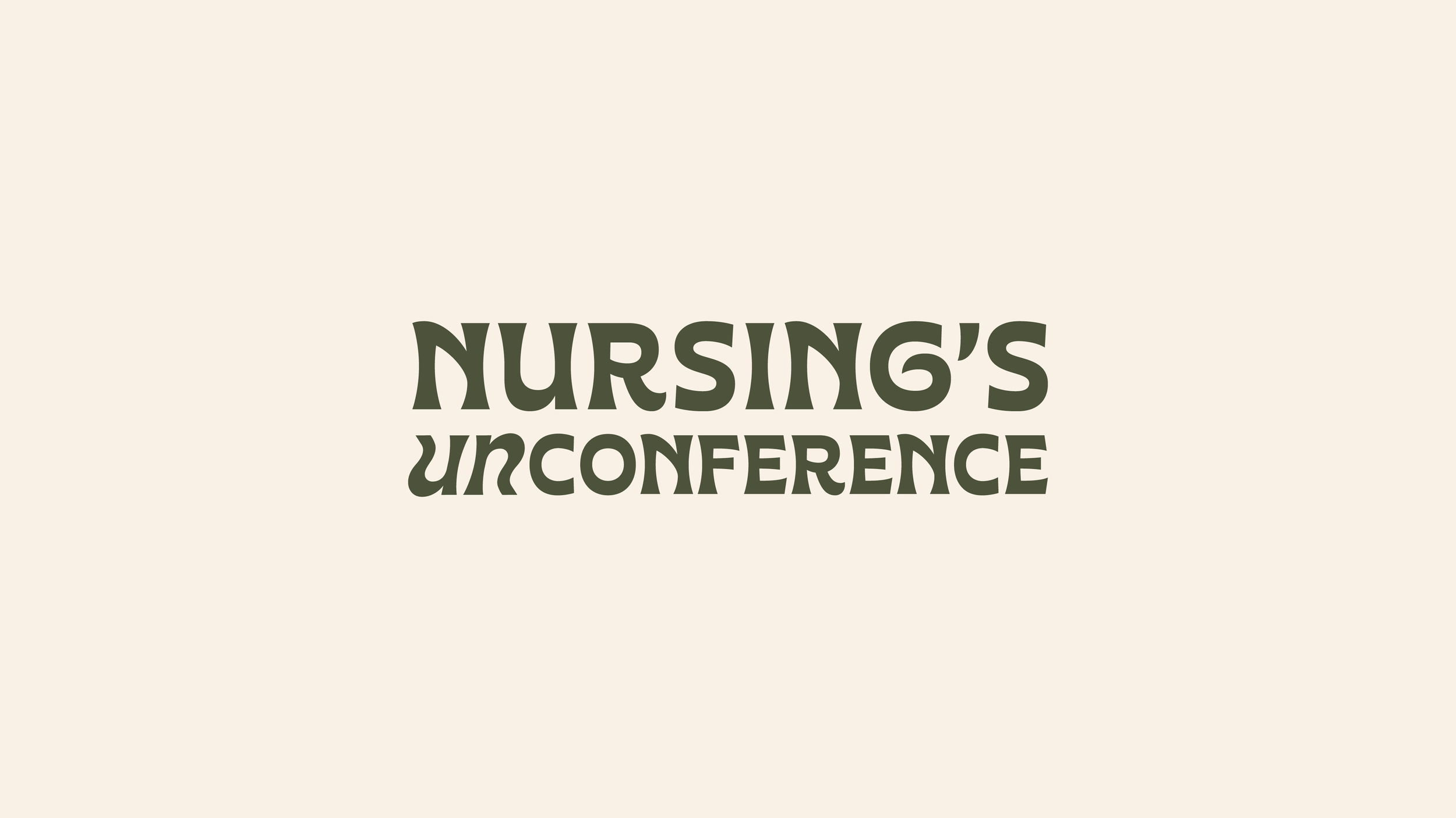
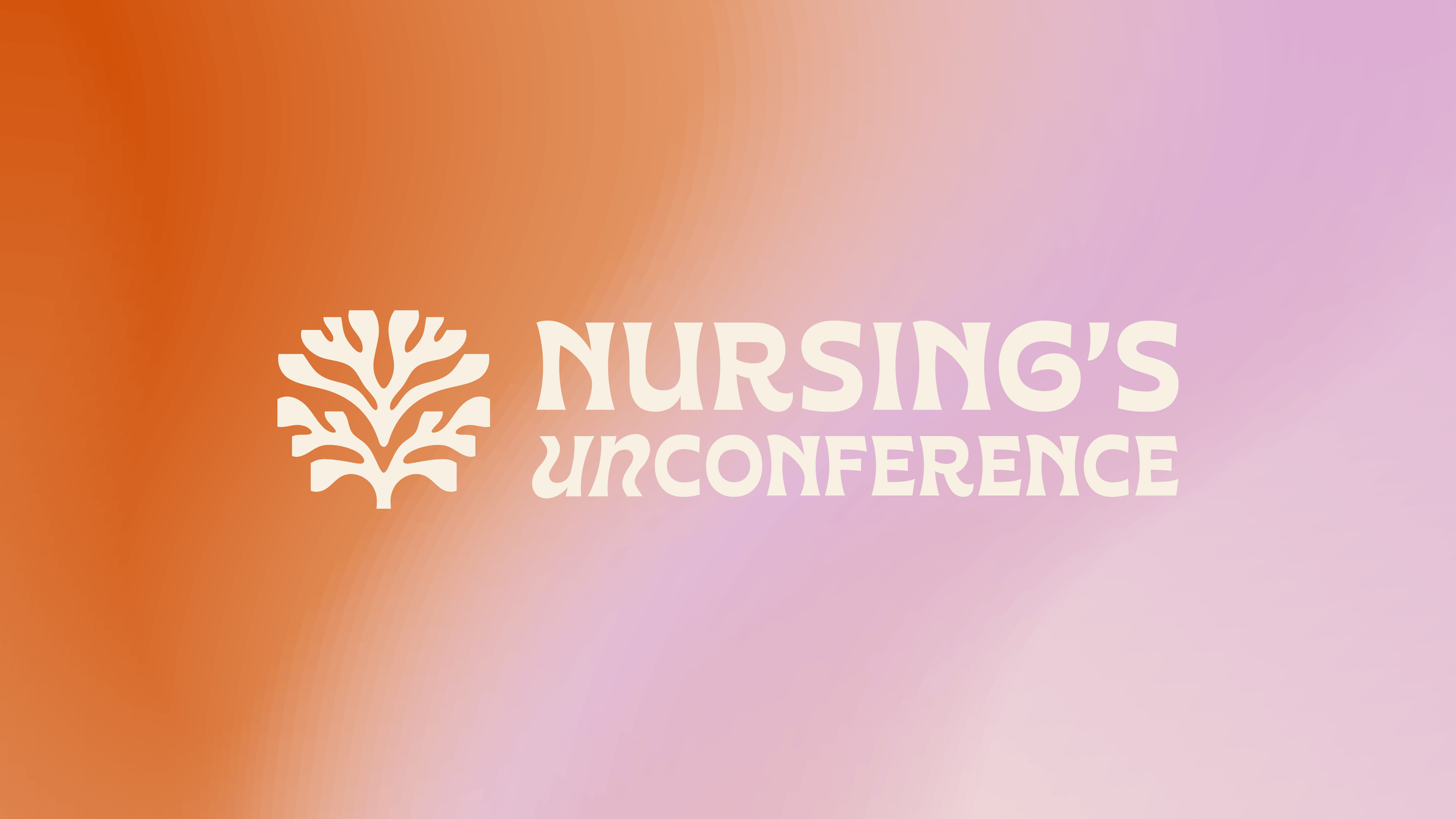
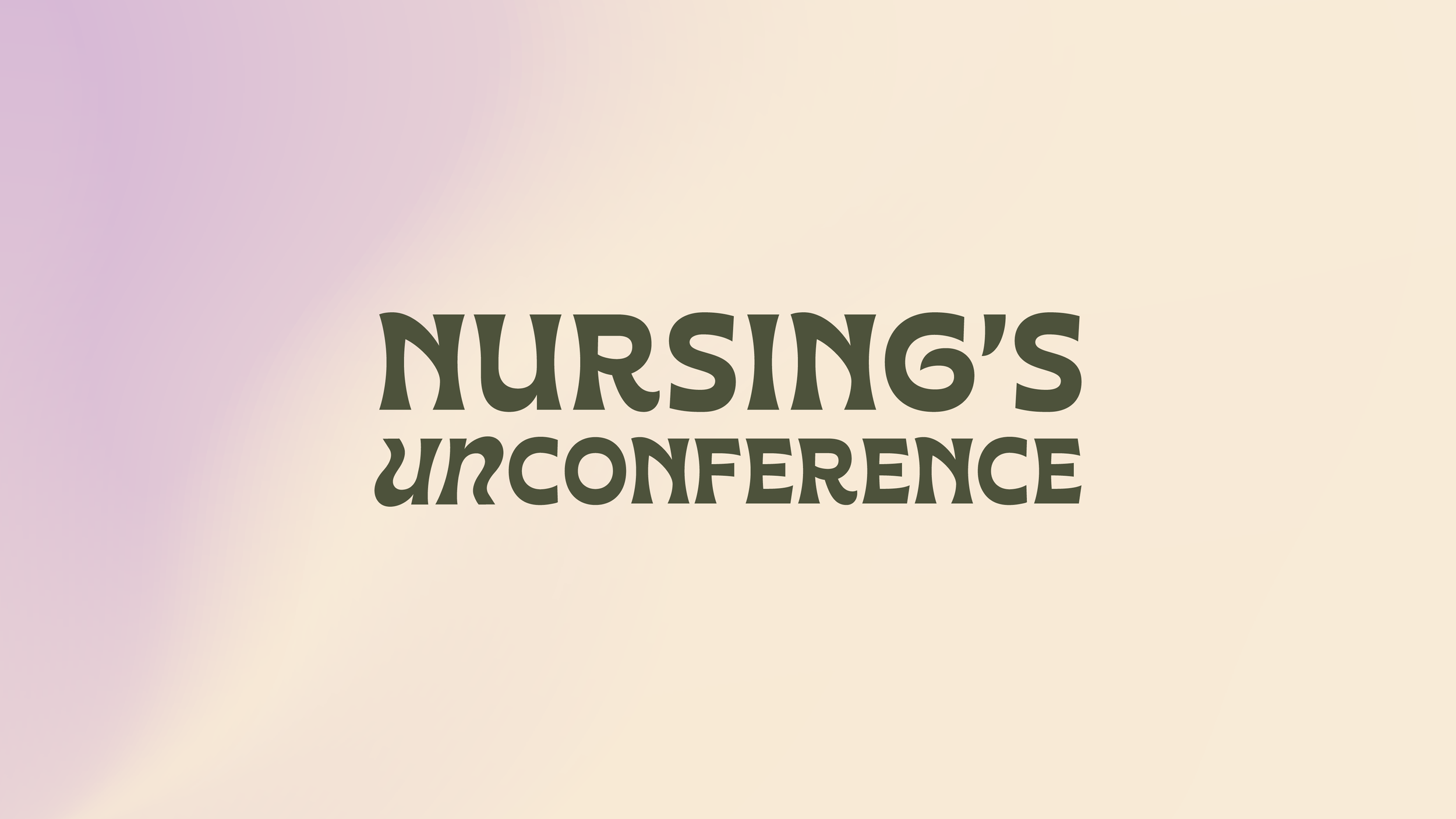
One of the biggest challenges in designing this brand was the brand name itself. Nursing's Unconference is long, which meant the typography needed to work hard to maintain balance, hierarchy, and legibility across different applications. A key design opportunity I found was emphasizing "UN", the prefix that defines the brand's philosophy of unlearning burnout.
The typography needed to strike a careful balance: professional enough for healthcare environments, yet distinctive enough to reflect the brand's unconventional approach. I selected a clean yet organic looking typeface as a foundation, then customized the letterforms, adjusting weights and proportions to create a stronger, more balanced lockup. The UN was taken further and created from scratch to stand apart from the rest of the wordmark, while still feeling integrated. This exploration created a subtle sense of disruption that mirrors the brand's challenge to traditional nursing culture.
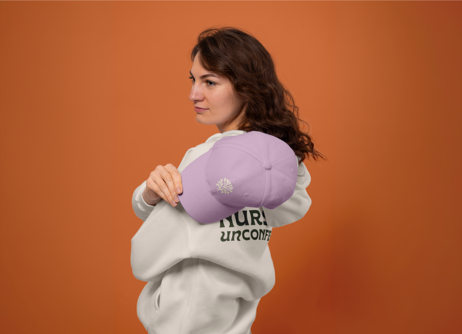
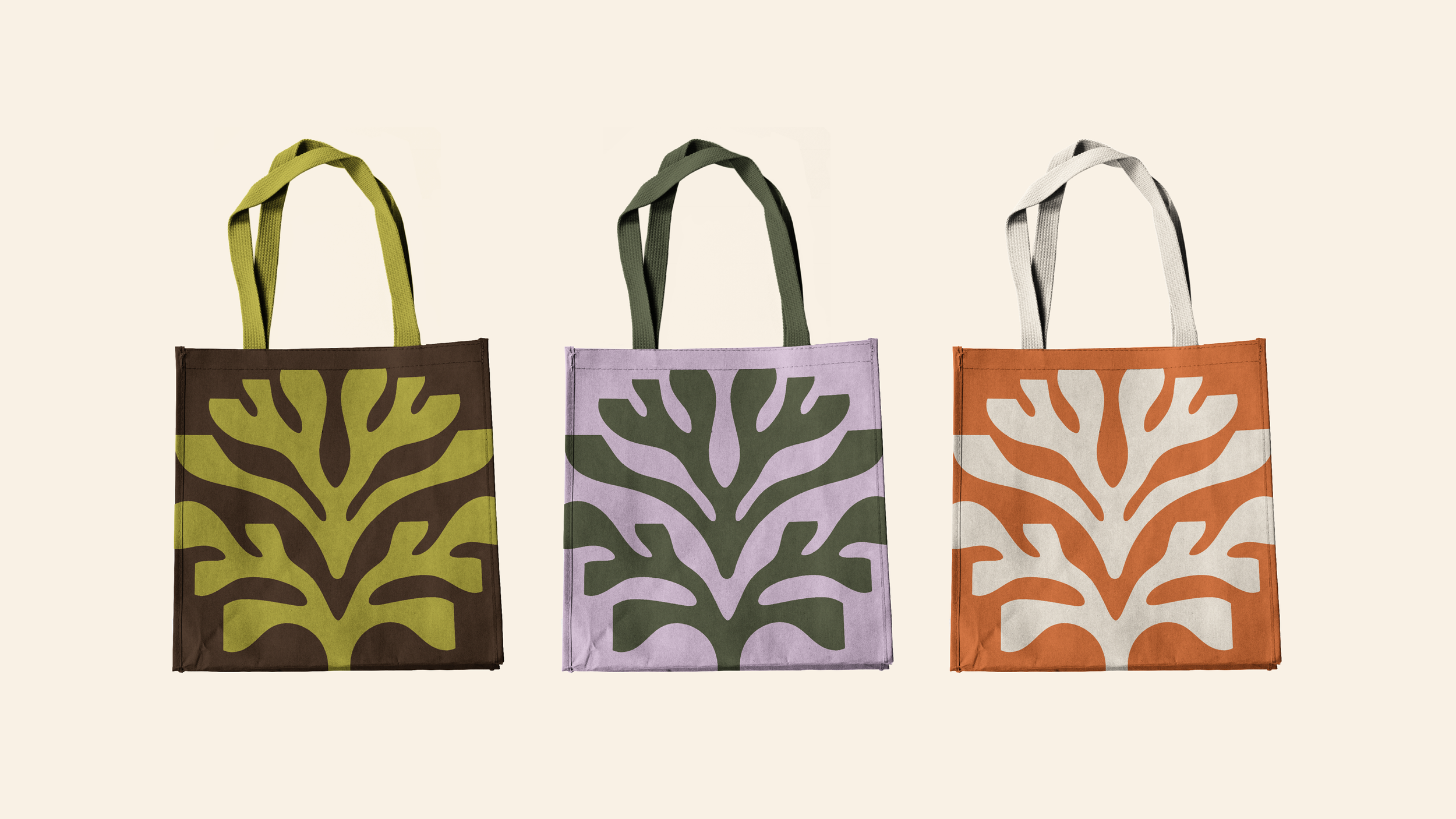
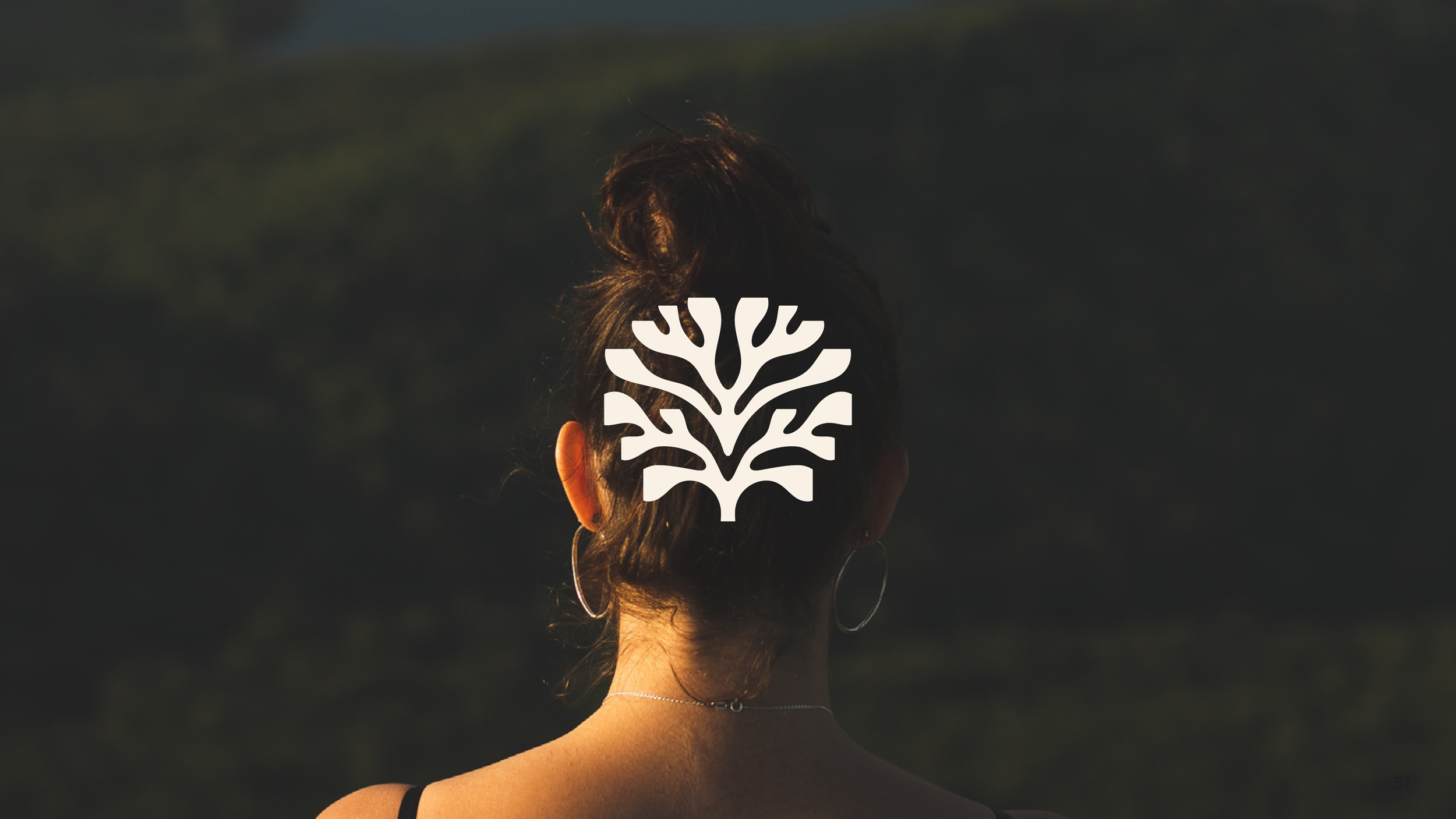
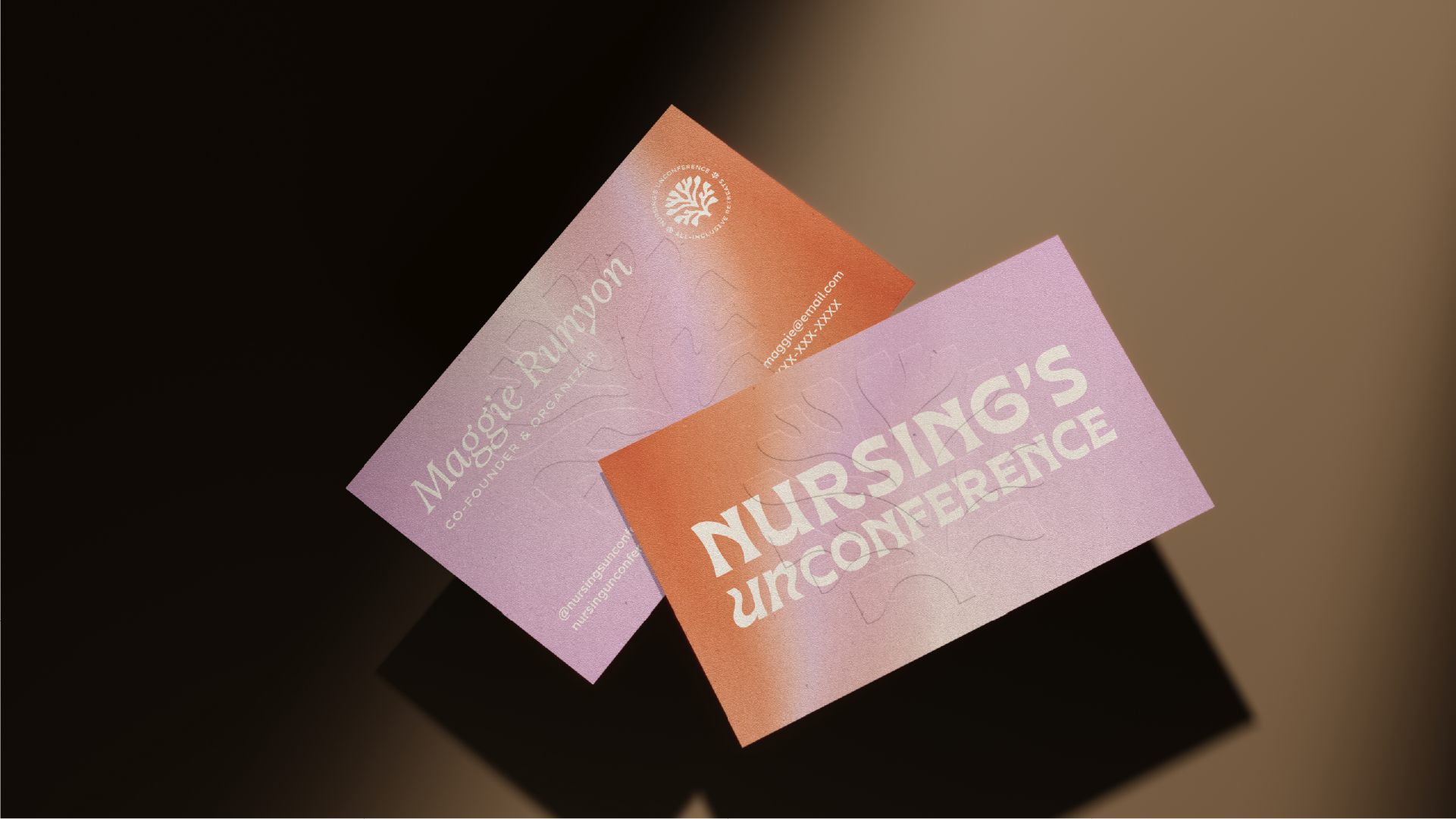
Logos
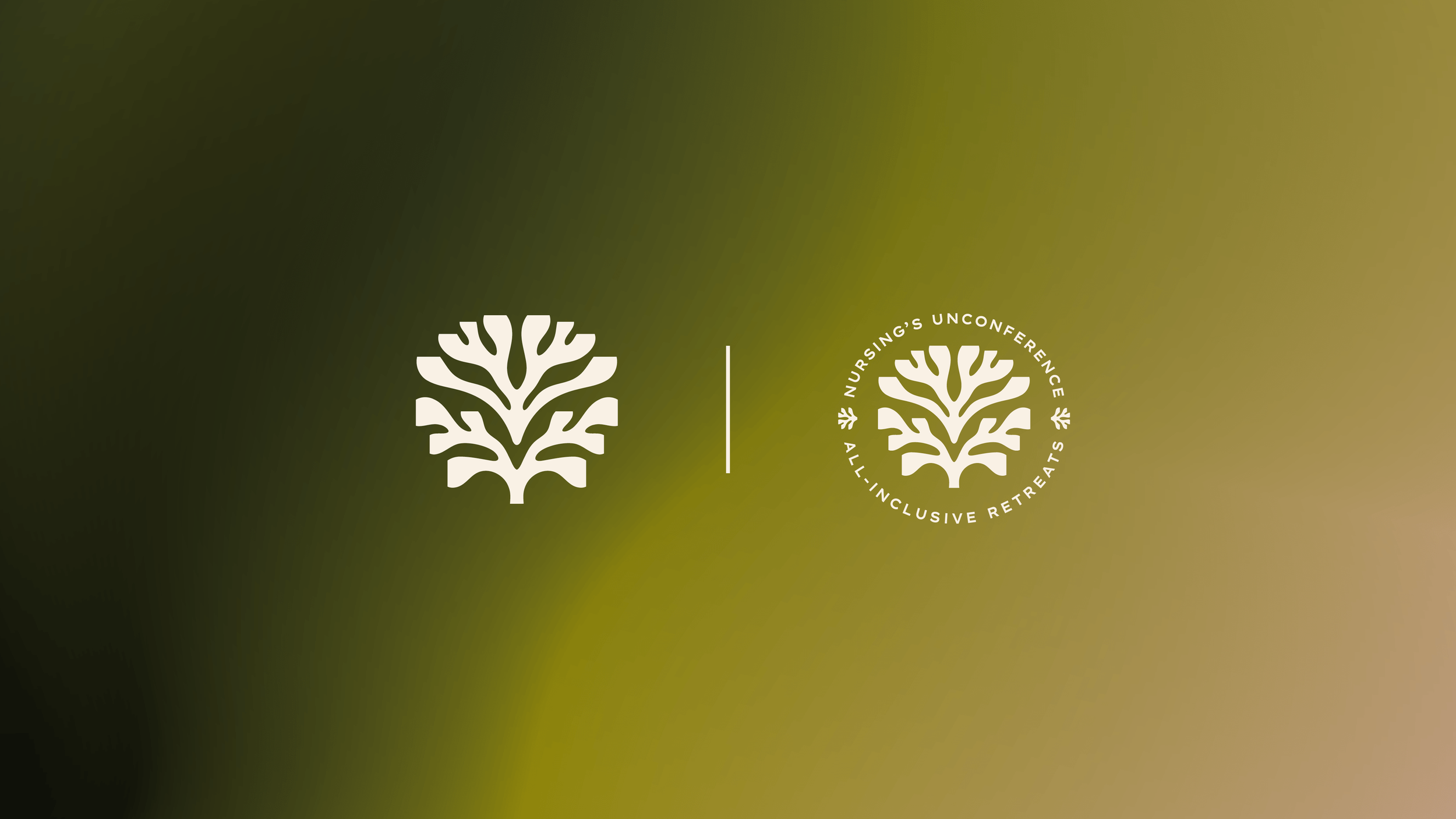
The icon combines three core ideas: trees, roots, and the brain. Together, these elements symbolize growth, community, grounding, healing, and transformation: the journey nurses will experience through the retreats and healing spaces. To support brand recognition, I also developed a secondary lockup that pairs the icon with the full brand name and service descriptor. This variation provides additional context for first-time audiences, clearly communicating both who the organization is and what it offers.
Color Palette
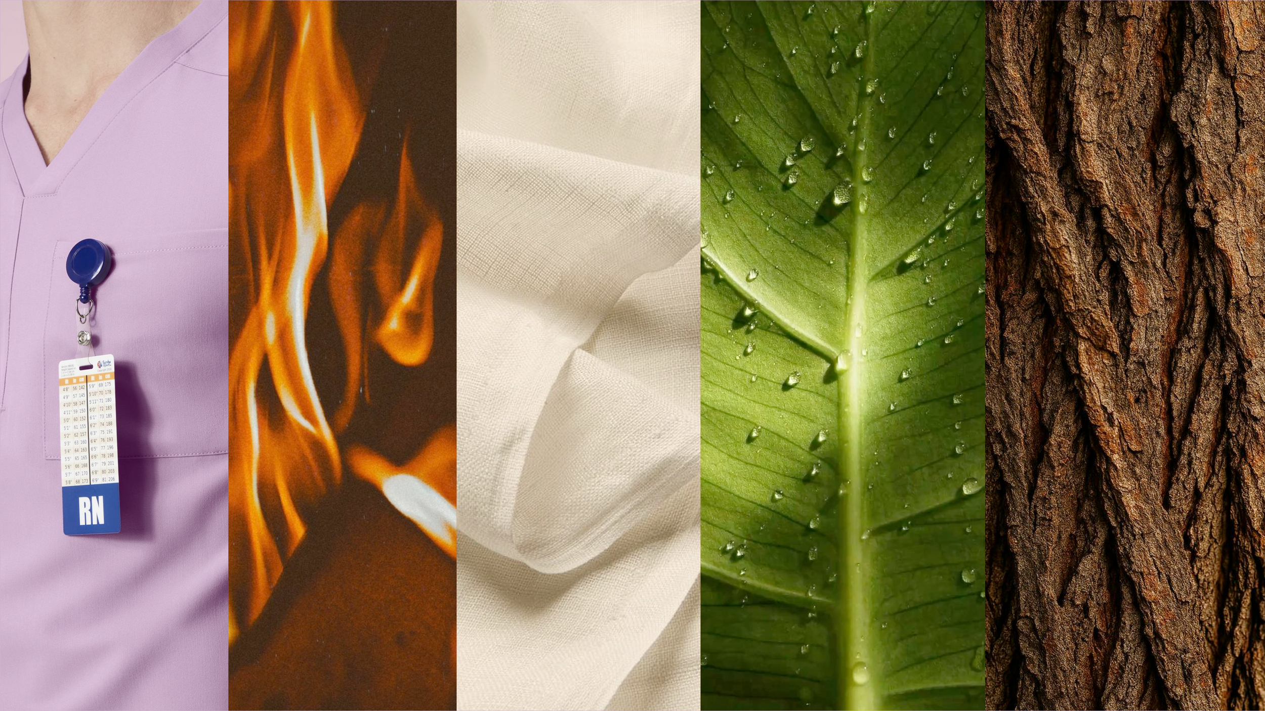
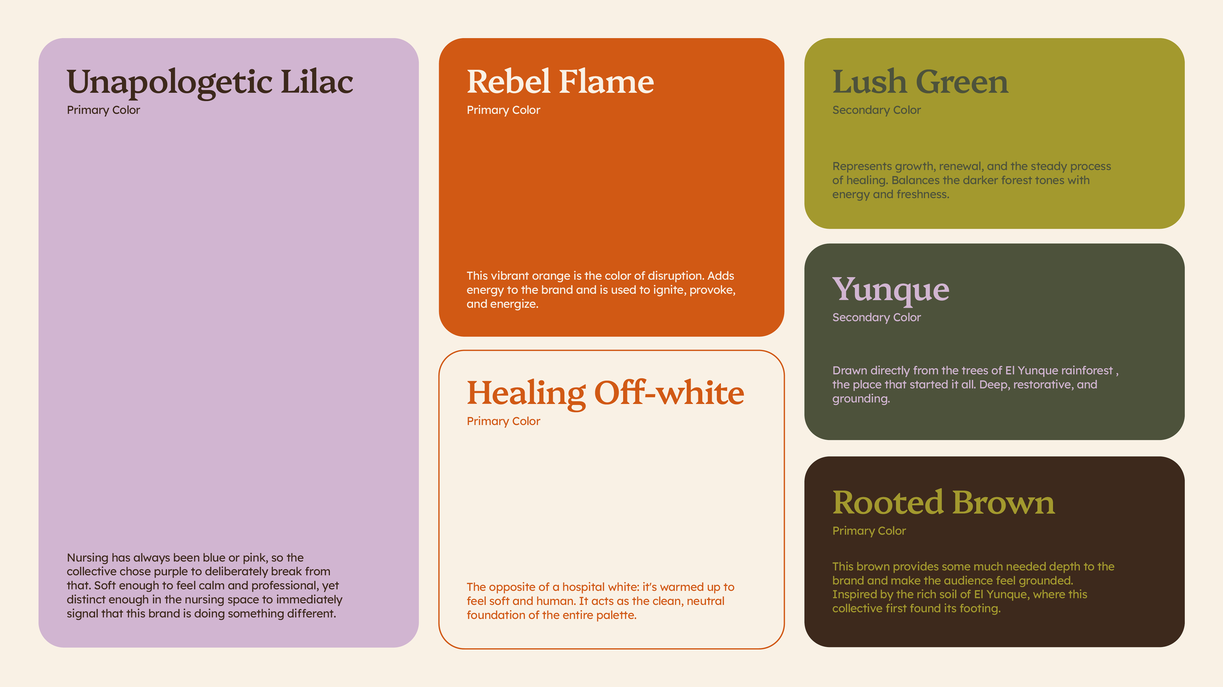
The brand’s color palette was deliberately chosen to distance the brand from the typical healthcare and wellness spaces where cold blues, clinical whites, and bright greens often dominate. Instead, the palette was built from natural references tied to the collective’s ethos, creating a system that feels grounded, restorative, and distinctly unique.
Graphic Assets
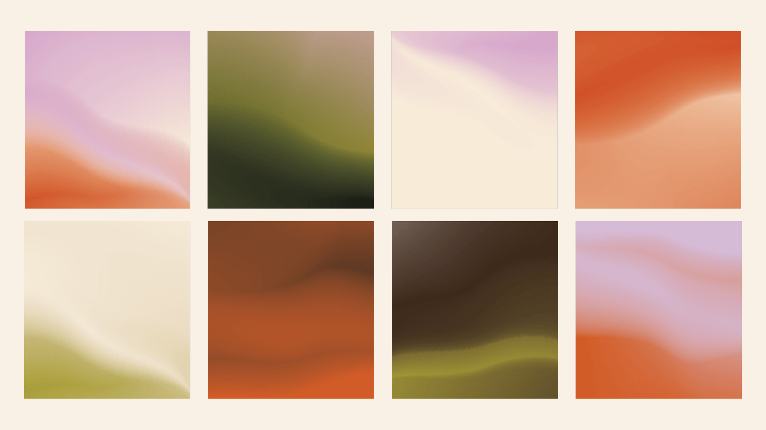
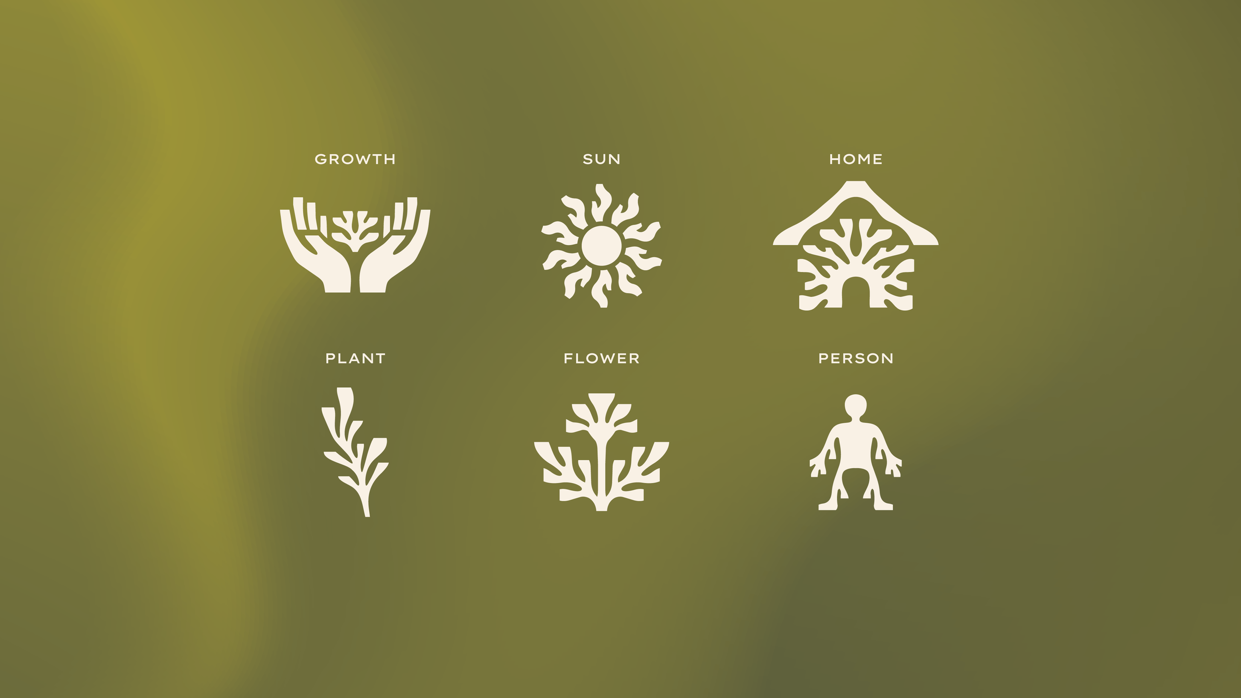
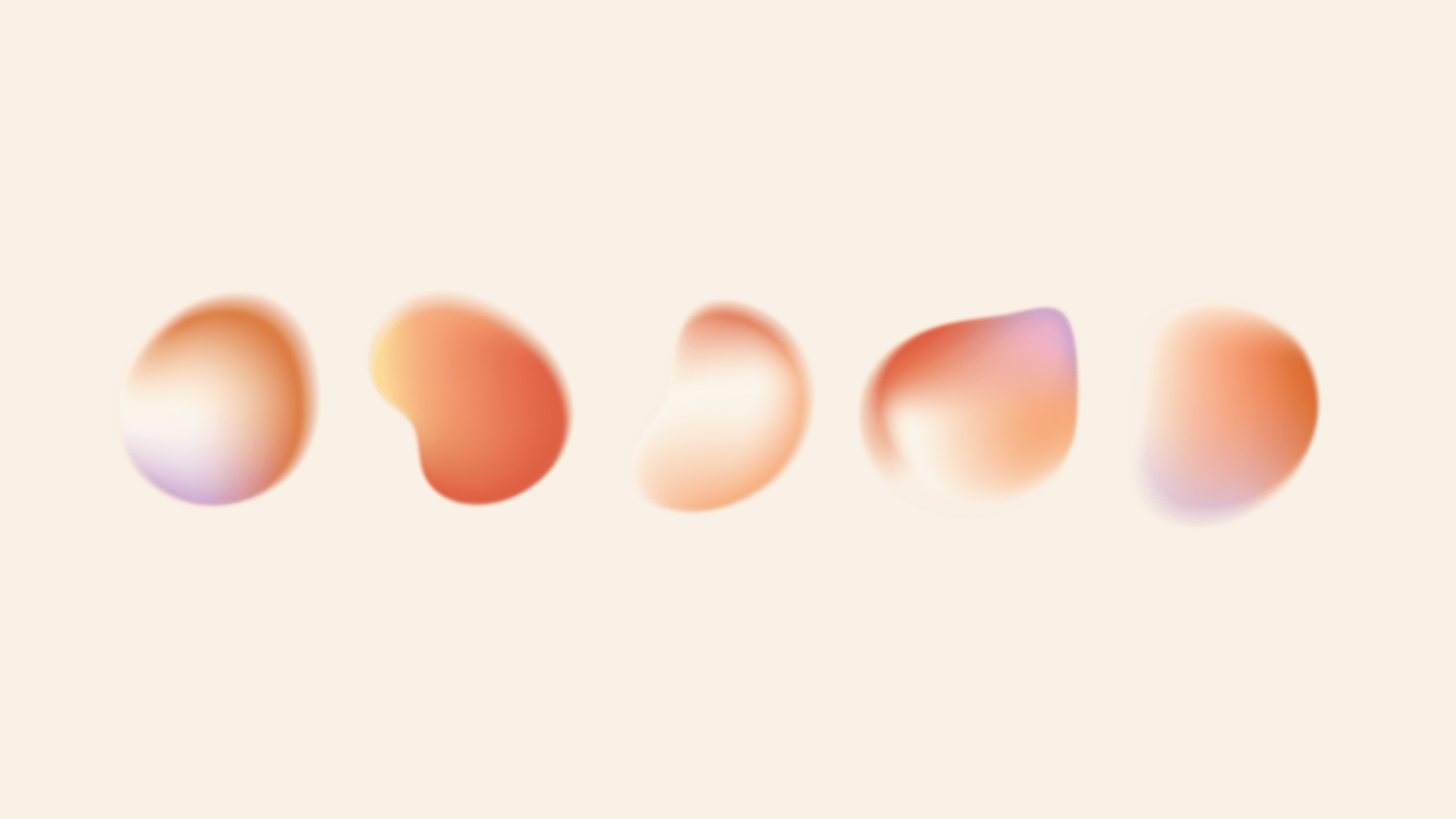
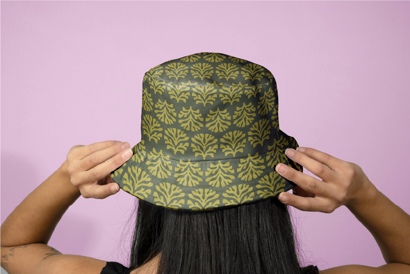
Gradients and fluid forms are used as graphic assets, patterns and backgrounds, representing the shifting, often complex nature of healthcare and the emotional spectrum nurses are forced to navigate through. The icons, on the other hand, were created from the same root-like forms that are also seen in the brand’s logo.
These elements are designed to layer and stack, creating depth, rhythm, and visual richness across applications while maintaining a cohesive and recognizable system.