Puentes del Caribe

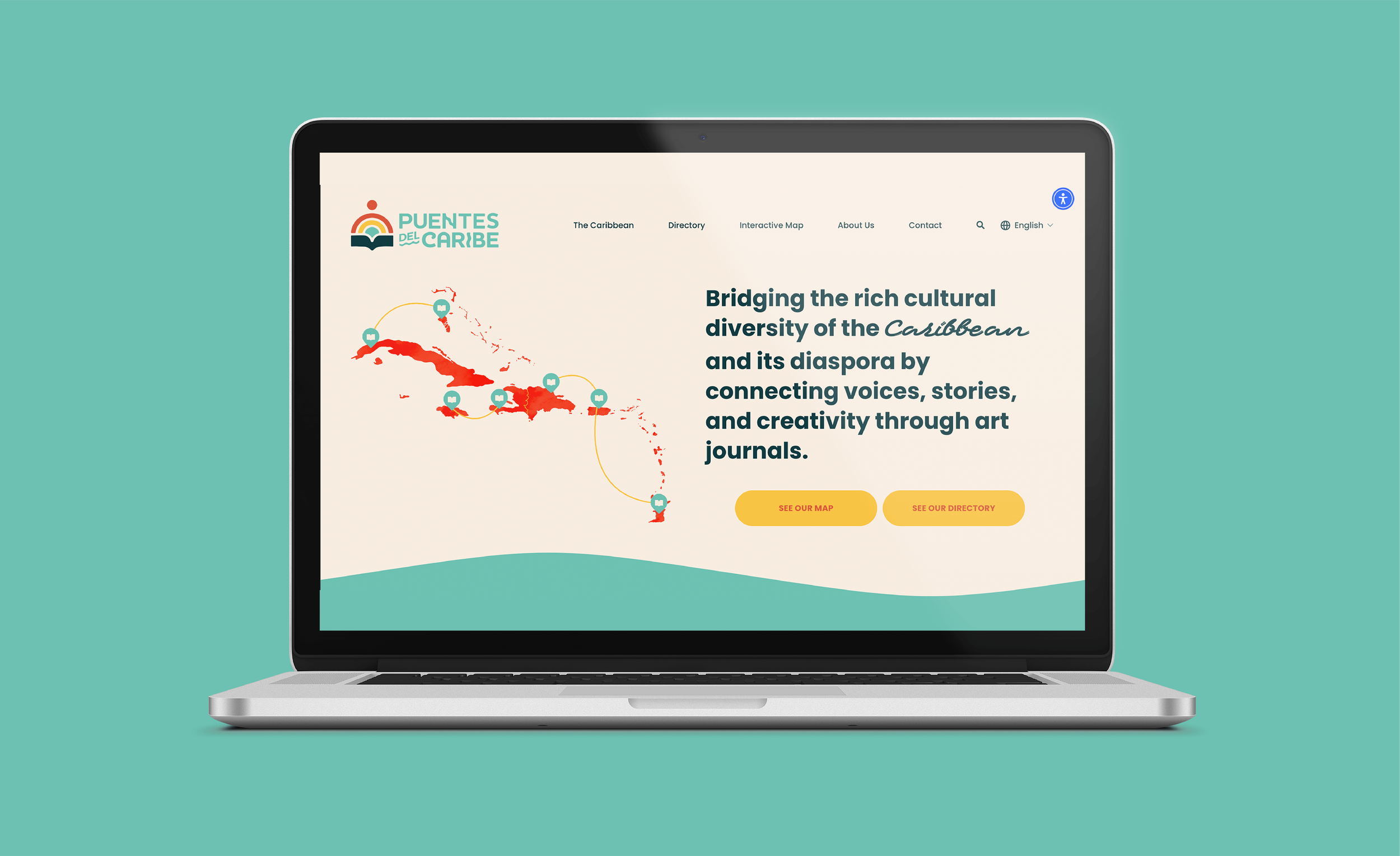
For Puentes del Caribe, I had the exciting opportunity to design their branding from scratch. Puentes del Caribe aims to be a go-to resource for academics, institutions, students, and anyone with a passion for Caribbean art with a clean, yet playful touch. Naturally, my goal was to create a vibrant, fresh identity that embodies the spirit of the Caribbean while maintaining a professional and academic feel.
Logo Transformation
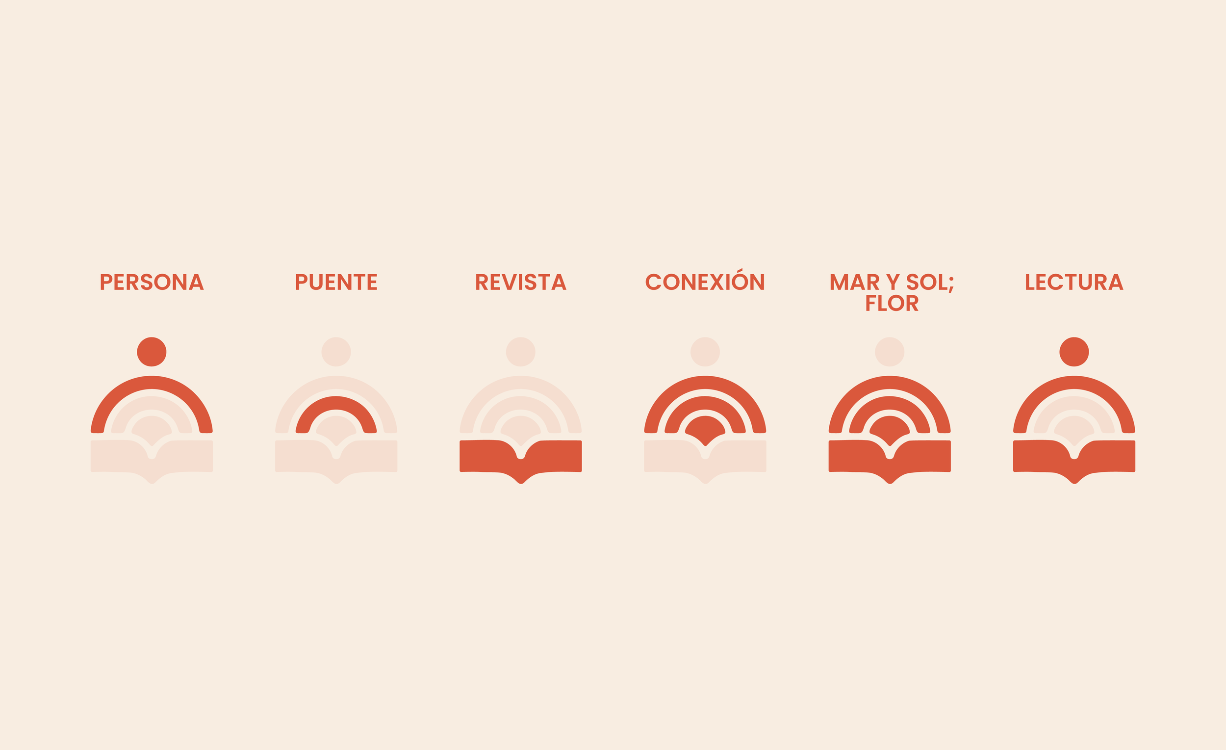
The font for the logo was heavily customized to give the brand a unique visual identity that feels both clean and playful, while also evoking the essence of the ocean—a key part of the Caribbean experience. The logo mark itself blends several interpretations, capturing the mission of Puentes del Caribe in a single symbol: it features a person, bridge, magazine, connection, the sun and ocean, a flower, and the act of reading. Puentes del Caribe will be the bridge that connects Caribbean art with the rest of the world.
Logo Suite

I provided Puentes del Caribe with a complete logo suite to accommodate a variety of uses. These elements can work together or stand alone, ensuring flexibility across multiple applications.
Assets and Illustrations

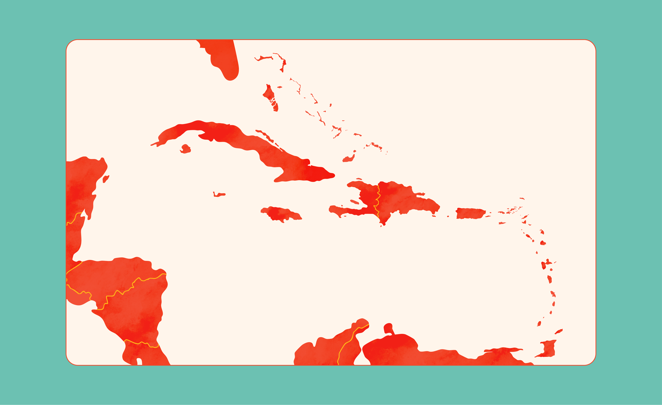
I also created a set of assets and icons for the website and branding, drawing inspiration from Caribbean culture and artistic elements. These assets are designed to reinforce the brand’s dynamic aesthetic. A major highlight was the creation of an on-brand map—an important feature on the website, where users can explore and discover magazines from the region. The map, along with other assets, incorporates a subtle watercolor texture, tying everything back to an artsy, creative vibe that’s central to the brand.
Brand Items


Socials
Initial proposal VS. Final product